Finding the right images can be a time-consuming exercise. (c)Thinkstock
You’ve read Garr Reynolds’ Presentation Zen or Nancy Duarte’s Slide:ology, and you’re energized to start using more images in your PowerPoint presentations. All of the examples in their presentation design books are amazing. They make it look so easy, but you’ve probably found it’s not as easy as it looks. Searching for just the right image can be a time-consuming and sometimes frustrating process.
I thought I’d share some practical tips for finding good images for your next presentation (I’ve also done a two-part article on what makes an image good). There are a couple of different scenarios when you’re searching for images. In some cases, you generally know what you are looking for. For example, I might need a photo of a boat, and it is fairly straightforward to accomplish this task on a stock photography site. However, there are times when you don’t necessarily know the subject of your image and you need inspiration. For either scenario, the following tips will help you to be more effective in your quest for good images for your presentations:
Tip #1 – Try various keywords in your search
When you’re searching for images on a stock photography site (e.g., an image of a boat), I recommend trying different synonyms of the word (e.g., ship), specific types/categories of the word (e.g., yacht, steamboat, canoe, etc.), or related words (e.g., fishing, sailing, cruise, etc.). You might want to use a thesaurus or keyword lists on actual image pages to identify other keywords you can use in your image search.
Most of the stock photos are assigned meta tags by the photographers, and some of them do a better job of tagging their photos than others. You may miss out on a great photo simply because you didn’t use the right keyword in your search. The most obvious keyword may not yield the best results.

These are the metatags for a particular image (found on the image page). You can see what other keywords are being used for the same image and see if there's another keyword that is better than the one you're using.
Tip #2 – Get inspiration from other people (via Google)
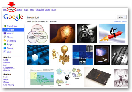
If you need an image for a more abstract topic (e.g., teamwork, willpower, or arrogance), you may not know where to begin your image search because you don’t have a specific subject in mind. It can be helpful to see what subjects or approaches other people have used for the same keyword. A quick Google image search can yield some great ideas (Note: you might want to adjust the Safesearch settings so you don’t have potentially embarrassing images showing up on your desktop. Seemingly harmless keywords can turn up some interesting images).
Once you have some inspiration from what other people have done, you can then find specific images on a stock photography site. You need to be careful about just taking images from random sites via Google image searches. First, the images may have copyrights. Second, most of the website images are too small or low resolution to show well in presentations.

Google Image search can be a great source of inspiration when you're in a hurry or stuck in a creative rut.
Tip #3 – Realize filters are your friends

Useful search filters on Thinkstock
Many stock photography sites have introduced advanced search filters that can speed up your image searches and also increase your success rate. Sites such as Thinkstock (Disclaimer: I have received a complimentary subscription from Thinkstock) and iStockphoto have added a variety of useful search filters so that you can better target your searches. For example, on Thinkstock you can narrow down your search for “innovation” images by subject (e.g., “business”), concept (e.g., “ideas”), people (e.g., “no people”), style (e.g., “close-ups”), collections (e.g., Comstock images), etc. In addition, some stock photography sites allow you to apply negative keywords to your searches (e.g., not “light bulbs”). In addition, Boolean filters (AND, OR, NOT) and searching within results can help you to narrow down the thousands of images to a more manageable and targeted set of photos.
Tip #4 – Take full advantage of useful site features
Stock photography sites offer various tools and features that can help your quest for good images. One useful tool is the light box, which enables you to save images to a folder. Sometimes you come across decent images, but you’re not sure if you’re going to find a better image around the corner. It’s a best practice to add the image to your light box so you can easily find it if you decide you really do need it.
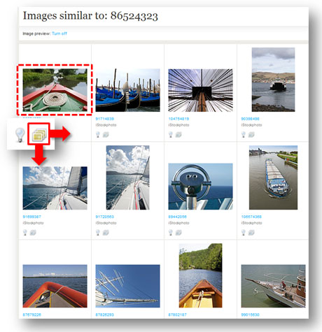
Another useful search feature is the ability to expand the number of images per page. Seeing more images at a time can speed up your searching. Finally, every site is going to have unique features, and I really like Thinkstock’s “view similar images” feature, which allows you to see other photos with a similar composition. This feature can come in handy when you’re trying to find a slightly different variation of an image that you’ve already found or a series of similar-looking images for a theme in your presentation.

I love the "view similar images" feature on Thinkstock.
Tip #5 – Watch the time clock

Be careful how long you take to find images. You can't get it back once it's gone. (c)Thinkstock
You may be searching for the perfect image – but it’s not jumping out at you. You may be trying the tips mentioned above to find the right image. However, you need to know when it’s time to cut bait and settle for something that may not be ideal or rethink your idea for the image. You can spend hours looking for an elusive, “big bang” image, and still come up empty handed. As I’ve stated many times before, time is the root of all PowerPoint evil. When you carelessly waste your time searching for images, you’re going to have less time to actually build or rehearse your slides. Sometimes a “good enough” image has to be good enough.
Please share any image search secrets that have helped you in the past. An old ninja can still learn a trick or two. Good luck in your future image searches!


