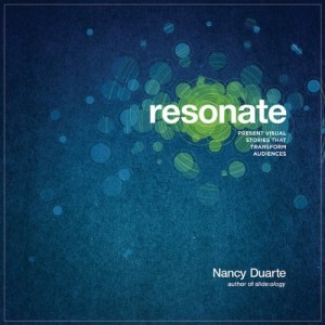
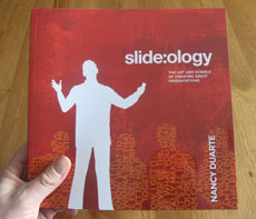
After the success of her first book, Slide:ology, Nancy Duarte provides us with an interesting prequel, Resonate: Present Visual Stories that Transform Audiences. While Slide:ology focused more on the tactics of effective presentation design, Duarte’s Resonate book focuses the strategy or framework behind effective presentations. Although Resonate’s focus is different than Slide:ology’s, I think it covers important material for anyone who builds presentations on a frequent basis. Overall, I give this book four-and-a-half of out of five stars.
Key takeaways from Resonate
In contrast to other presentation design books which have more of an instructional feel, I found Resonate to be more inspirational in nature. Duarte reminded me of what most presentations are striving to achieve – that is change. We’re trying to change either the minds or behaviors of our audiences. We need to have a human connection with our audiences in order to achieve the change we’re striving for.
In order to generate a deep connection with our audiences, Duarte emphasizes the importance of having an emotional appeal in presentations, not just presenting facts and figures. “People rarely act by reason alone. You need to tap into other deeply seated desires and beliefs in order to be persuasive.” I’ve seen many fellow analysts make the mistake of presuming that the data will “speak for itself”. Duarte encourages us to “use emotions as a tool to bring emphasis to the facts so they stand out”, and I’ve also discovered how emotional appeals can really complement data.
A great way to evoke emotional responses from your audience is through the use of storytelling. You build trust and credibility through stories when your audience recognizes that you share similar values, goals, and experiences. Chip and Dan Heath’s Made to Stick first exposed me to the importance and power of stories, and it’s great to see Duarte further expand upon the art and science of storytelling in presentation design. Duarte spends a significant portion of her book deconstructing various stories and speeches to identify the key elements that can be applied to presentations.
One main takeaway was that presenters must identify a conflict or imbalance that their presentation resolves for their audience – contrasting “what is” with “what could be”. Throughout a presentation – in the beginning, middle, and end – you are shifting back and forth between what is and what could be, juxtaposing the two sides to engage your audience and hold their attention.
Duarte also highlights how your audience is the real hero of your story/presentation, and the presenter is simply the storyteller and mentor. I’ve seen some very knowledgeable presenters who were very passionate about their topics — but didn’t care about their audiences. The presenters thought they were the heroes. Duarte declared “passion for your idea should drive you to invest in its communication” and that includes understanding your audience and tailoring your message to them.
Throughout her Resonate book, Duarte does a good job of infusing real-life, interesting examples from all kinds of past and present famous people (e.g., MLK, Leonard Bernstein, Steve Jobs, etc.). In Chapter 7 of Resonate, Nancy Duarte introduces the concept of creating S.T.A.R. moments (Something They’ll Always Remember) within your presentations. She identified five types of these moments and provided interesting examples for each: memorable dramatizations (e.g., a prop, demo, or skit), repeatable sound bites (i.e., slogans), evocative visuals, emotive storytelling, and shocking statistics.
Final Thoughts
Resonate is similar to Slide:ology in terms of being a highly visual, attractive book. However, readers may be a little disappointed that there aren’t as many actual slide examples in Resonate. I believe many people enjoy seeing expertly-designed slides in the other presentation design books such as Slide:ology, Presentation Zen, and Presentation Zen Design. Despite this perceived drawback, Resonate is a great “strategic” design book and a worthy addition to any presenter’s library. Nancy Duarte made me think and re-evaluate my own presentation design style, which I think is a compliment to her new book.


