Jan 31 2010

PowerPoint SmartArt is Dumb

Theres no Bob Ross feature in PowerPoint to guide you through the process of visual communication.

SmartArt is not PowerPoint + Bob Ross.

PowerPoint is often criticized for encouraging presenters to rely too heavily on bullet points and not helping people to communicate more visually. Microsoft added a feature known as SmartArt to help convert text into various stylized graphics. When you’re designing your PowerPoint presentation, you can quickly rotate through various shapes, colors, layouts, and styles in order to find the right graphic for your presentation.

For novice or casual PowerPoint users, SmartArt can be a handy tool for quickly making your presentation more visual and professional looking. If you decide to use SmartArt in your PowerPoint slides, you need to be careful because SmartArt is dumb. Continue reading “PowerPoint SmartArt is Dumb”
Tags: , , , , ,


Jul 11 2009

How Colors Can Make Your PowerPoint Charts More Digestible

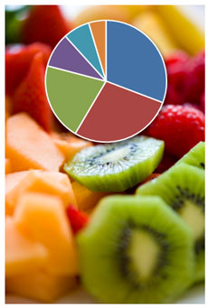
Mmmm. It all looks good. Where do I focus? (c) iStockPhoto / Adventure Photo

Mmmm. Fruit salad. It all looks good. But where do I focus? (c) iStockPhoto / Adventure Photo

By default PowerPoint or Excel 2007 will create multicolored pie charts or single-colored bar charts. Unfortunately, these default color combinations can cause charts to communicate less effectively unless they are modified.

In most cases, when you’re using charts in PowerPoint slides you’re trying to highlight a specific data point or a subset of data points:

Tags: , , , , ,


Jun 30 2009

Curse of Pac-Man: the Dangers of 3D Charts in PowerPoint

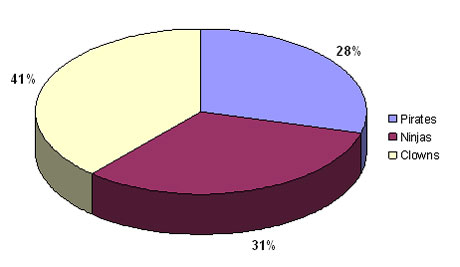
If you grew up playing video games in the 80’s, you’ll have fond memories of Pac-Man and Ms. Pac-Man. These classic arcade games were revolutionary in their day and continue to be favorites today. If you compare their simple 2D format to today’s lifelike first-person shooters, you wonder why people still continue to play them. The fact is their simple game play is still infectious. Continue reading “Curse of Pac-Man: the Dangers of 3D Charts in PowerPoint”

Tags: , , , , , , ,


Feb 05 2009

Make Your Pie Charts Pop in PowerPoint 2007

Are your PowerPoint pie charts looking a little tired and stale? Is it time to make your pie chart data stand out? We’ve seen the same basic pie chart design since Office 97.

Look familiar? It's a whole lot of PowerPoint pie chart ugly. Wfffff. I can hear the air going out of your presentation if you're still using pie charts like this one.

Look familiar? It's a whole lot of PowerPoint pie chart ugly. Wfffff. I can hear the air going out of your presentation if you're still using pie charts like this one.

In PowerPoint 2007, there are many new shape effects that can help you to produce Photoshop-like results. One such effect is the bevel effect. When you use it in combination with your pie charts you can really add some zing to your PowerPoint presentations. Continue reading “Make Your Pie Charts Pop in PowerPoint 2007”

Tags: , , , , , , ,