On the first and second days, I covered consistency and the actual bullets. Now I’m going to turn my focus to bullet point layout and structure. Before I dive into this area, take a moment to think about your desk. What does it look like? Is it cluttered or clean? Continue reading “Bullet Point Boot Camp – Day Three”
Sep 12 2009
Bullet Point Boot Camp – Day One

Please keep Corporate America beautiful -- no bullet points!
Most presentation experts like Seth Godin and Cliff Atkinson are not big fans of bullet points. In fact, every time someone uses bullet points in a presentation slide, I believe Seth Godin sheds a tear. Many of these experts have initiated a “bullet point” backlash – advocating for a more visual approach with less text. This visual approach is really well-suited to strategic presentations (e.g., keynotes). However, most tactical presentations – the everyday variety that we see multiple times each week at work – depend more heavily on bullet points. Continue reading “Bullet Point Boot Camp – Day One”
Nov 26 2008
Line Spacing Tips for PowerPoint 2007

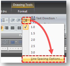
How to access the line spacing options in PowerPoint 2007.
If you used PowerPoint 2003 and recently upgraded to PowerPoint 2007, you probably noticed a significant change in how PowerPoint 2007 handles the line spacing of text within your slides. Line spacing in PowerPoint 2007 and Word 2007 are now almost exactly the same. Microsoft obviously wanted to create a unified approach to line spacing across its Microsoft Office suite. However, the simple and straightforward approach in previous versions of PowerPoint is now a little more tricky. Continue reading “Line Spacing Tips for PowerPoint 2007”


