Mar 10 2009

PowerPoint and the Quest for the “Big Bang” Image

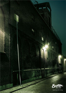
That's strong toilet paper...

That's strong toilet paper...

I was reading a recent post by Jan Schultink on finding that “one image or visual concept that really nails down the idea in one big bang.” Jan shared an example of a great advertising ad for Scottex toilet paper, which was highlighted on the advertising blog, adgoodness.

If you’ve read any of the popular presentation design books such as Presentation Zen or Slide:ology, you’ll be familiar with the visual presentation style that they promote. As you thumb through the pages of these books, you see several beautiful slides that demonstrate how well-chosen stock photos can emphasize a key point.

However, just looking at the finished product hides the time-consuming process that can go into finding a single “big bang” image. Sometimes it can be challenging to even find one good image for a particular slide let alone a “big bang” image. Continue reading “PowerPoint and the Quest for the “Big Bang” Image”
Tags: , , , , , ,


Mar 04 2009

Ten Commandments of PowerPoint Ninjutsu

Many business people use PowerPoint religiously each week. Although millions of PowerPoint presentations are being prepared and delivered on a regular basis around the world, it often feels as though “PowerPoint land” is a lawless “wild west”. Presentation audiences – big and small – have endured heinous PowerPoint sins for years.

PowerPoint users need to be held to a higher standard so here are the Ten Commandments of PowerPoint Ninjutsu that I came up with: Continue reading “Ten Commandments of PowerPoint Ninjutsu”

Tags: , , , , , , , , , , , , , , , ,


Jan 16 2009

PowerPoint Color Transparency Tip

By removing the white background from an image, you can layer one image on top of another graphic.

By removing the white background from an image, you can layer one image on top of another graphic.

When you’re working with picture images in PowerPoint, you may want to remove unnecessary parts of an image so that you can see other graphics behind it. If the image in question is a vector image (e.g., WMF), it may be very easy to customize the clip art image. However, if the image is a bitmap image (e.g., PNG, JPG, GIF), then you cannot simply “ungroup” the image and edit it as you want. If you own Photoshop and you’re proficient with it, this task may be fairly straightforward for you. However, many business users don’t have access to this expensive photo editing software or if they do, they may not know how to use it. Continue reading “PowerPoint Color Transparency Tip”

Tags: , , , , , , , , , , ,


Nov 01 2008

PowerPoint Design Principle #1: Consistency

Are your slides consistent like clockwork? (c)iStockphoto/Sabrina Dei Nobili

Too frequently business presentations resemble a rough mishmash of different colors, fonts, and formats. If these slides were a meal, the variety of options on your plate would leave you with some level of indigestion. If you want to enhance the professional look and feel of your slides, you should ensure they are consistent. Continue reading “PowerPoint Design Principle #1: Consistency”

Tags: , , , , , , , ,


Oct 29 2008

Four Steps to Customizing PowerPoint Clip Art

Have you ever struggled to find just the right clip art for a particular slide in a presentation? You may have searched through PowerPoint’s extensive collection of clip art images and identified some possible options. However, the clip art weren’t exactly what you had in mind due to one of the following reasons:

  • Image was okay but the colors didn’t match the rest of the images or slide background
  • Image was close to what you wanted but it had a few extra details in the illustration, which were unnecessary or distracting
  • Image contained a useful illustration but several background elements made the clip art unusable Continue reading “Four Steps to Customizing PowerPoint Clip Art”

Tags: , , , , , , , , ,


« Previous PageNext Page »