Feb 22 2011

Layering Technique for PowerPoint Objects

I love layers when it comes to parfait and PowerPoint. (c) Brand X / Thinkstock

Layering can be a useful technique and a potential shortcut in PowerPoint. You can use the order of the objects to create different visual effects that would be difficult or impossible to create by other means. Part of being a PowerPoint ninja is recognizing when a time-saving shortcut is the best approach.

Sometimes building a PowerPoint slide is like building a movie set. You don’t need to build a perfect replica of an entire Mayan temple — just a passageway and a few walls that will be a backdrop to your hero’s adventures. Movie directors and set designers know that only the visible parts of the set are what matter to the film. In other words, as long as your audience is only viewing your slides in the Slide Show view and it achieves the desired visual effect, it doesn’t matter how you construct the actual slide in PowerPoint.

I’ve used this particular layering trick a few times to hide edges within an object. In this case, I wanted to have arrows pointing inwards within this cloud. I could edit the arrows so that they didn’t overlap with the outline of the cloud objects. However, this would be very time-consuming to do as I would need to be careful to not overlap any of the outline edges.
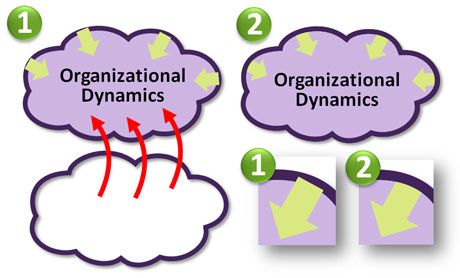
Once I added the arrows, I created a copy of the cloud which I layered on top of the other cloud.

Instead, I created a copy of the cloud image, made its fill transparent, kept the outline the same, and brought it to the front (Home tab > Arrange > Bring to Front). I then roughly adjusted the ends of the arrows so they would be hidden when I placed the transparent cloud directly in front. Essentially, the arrows became sandwiched between the two clouds, and my audience was none the wiser as to how I created the graphic. I’ve used this technique in various ways such as partially filling an object in a different color. Enjoy!

Tags: , , , ,


Nov 10 2010

Drawing in PowerPoint 101

Sometimes you need to draw in PowerPoint. (c) Thinkstock

In PowerPoint, you may have discovered that you have the ability to draw objects. Although not as powerful as Adobe’s Illustrator software, PowerPoint 2007 does give you a basic set of drawing options for adding custom objects to your PowerPoint slides. I view drawing in PowerPoint as a last resort when you can’t find an appropriate photo or clip art graphic. If I can customize an existing clip art image, I’m going to go that route before I embark down the path of drawing something in PowerPoint for a couple of reasons. Continue reading “Drawing in PowerPoint 101”

Tags: , , , , , ,


Aug 16 2010

Using Shadow Effects in PowerPoint 2007

Shadow effects can help images to leap from your slides. (c) Thinkstock

Shadow effects can help images to leap from your slides. (c) Thinkstock

One of my favorite new features of PowerPoint 2007 is the ability to add shadows to images, objects, and text. Previously in PowerPoint 2003, you were only able to add shadows to text — that’s it. You would need Photoshop and the necessary graphic editing skills to create professional-looking shadows for anything else. Now Microsoft gives you some Photoshop-like shadow effects in PowerPoint 2007.

Continue reading “Using Shadow Effects in PowerPoint 2007”

Tags: , , , , , , , , , ,


Jun 03 2010

Image Fading Technique in PowerPoint

Image fades can be useful in many ways (just like a good pair of jeans). (c) Thinkstock

Image fades can be useful in many situations (just like a good pair of jeans). (c) Thinkstock

You may have run into a situation where you wanted to fade a part of an image for a PowerPoint slide. By fade, I don’t mean the fade animation effect in PowerPoint. By fade, I mean blending the image into the background color or another solid color of your choice. You may have thought you needed Photoshop to create a fade effect with your images. However, you can achieve a fade effect directly in PowerPoint using an object with a blended transparent gradient fill. Continue reading “Image Fading Technique in PowerPoint”

Tags: , , , , ,


May 07 2010

What Makes an Image Good for Presentations – Part II

Composition also makes images better. (c)Thinkstock

Composition also makes images better. (c)Thinkstock

In the first part of this article, I discussed how good presentation images need to be both relevant and unique. In terms of the uniqueness of an image, there are two factors: the subject of the photo and the composition of the photo. In the previous article, I looked at how the subject of the photo can make a presentation image more interesting, and now I’m going to turn my attention to the second area: composition. Continue reading “What Makes an Image Good for Presentations – Part II”

Tags: , , , , , , , , , ,


Next Page »