Too frequently business presentations resemble a rough mishmash of different colors, fonts, and formats. If these slides were a meal, the variety of options on your plate would leave you with some level of indigestion. If you want to enhance the professional look and feel of your slides, you should ensure they are consistent. Continue reading “PowerPoint Design Principle #1: Consistency”
Oct 21 2008
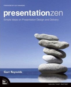
Book Review: Presentation Zen
Presentation Zen: Simple Ideas on Presentation Design and Delivery, written by Garr Reynolds, is an informative guide to presentation preparation, design, and delivery. If you’re not already familiar with the popular Presentation Zen blog, this book highlights many of his theories and techniques. If you’ve seen a presentation from famous presenters such as Seth Godin, Guy Kawasaki, or Steve Jobs, you’ll be familiar with the highly visual, stock-photo-heavy style that Reynolds advocates. Overall, I recommend this book (four of five stars) as a great resource for business presenters who want to improve their slides, not necessarily their PowerPoint skills. Continue reading “Book Review: Presentation Zen”
Oct 09 2008
PowerPoint Ninja Toolbox: Drawing Guides
Any aspiring PowerPoint ninja needs to be familiar with a subset of important features within PowerPoint. Through a series of PowerPoint Ninja “toolbox” articles, I will cover some of these key features. Whether you’re using PowerPoint 2003 or 2007, the Drawing Guide feature is very useful as you design new slides. Continue reading “PowerPoint Ninja Toolbox: Drawing Guides”
Aug 28 2008
PowerPoint Slides are like Sushi – Part I
I’d like to share with you a useful analogy I thought of in terms of breaking down all of the critical components of a PowerPoint presentation. All ninjas love good sushi so I’d like to compare a PowerPoint presentation to a sushi restaurant setting. I will look at some key elements in a sushi restaurant: the meal, tableware, chef, server, atmosphere, and customers. In this blog entry, I will focus on the first three areas. Continue reading “PowerPoint Slides are like Sushi – Part I”
« Previous Page