In my previous blog post, I discussed the different flavors of PowerPoint that exist. It’s not just vanilla or even double-chocolate fudge brownie. We need to accept the fact that there are multiple flavors — at least 31 — if not more. Continue reading “31 Flavors of PowerPoint – Part II”
Jul 27 2009
31 Flavors of PowerPoint – Part I
Too often I hear people talk about PowerPoint presentations like there is only one flavor of PowerPoint. If you read popular presentation design books like Presentation Zen or Slide:ology, you’d swear that most people are tasked with keynote presentations like Seth Godin and Steve Jobs are. A more visual approach with less text is definitely a good strategy for keynote presentations. However, let’s be realistic that only about 0.012% of presenters are delivering keynote presentations on a regular basis. Continue reading “31 Flavors of PowerPoint – Part I”
Apr 20 2009
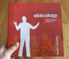
Book Review: Slide:ology
Slide:ology: The Art and Science of Creating Great Presentations, written by Nancy Duarte, is a comprehensive guide to presentation design. Similar to Garr Reynolds of Presentation Zen, Nancy advocates a more visual approach to slide creation – a “new slide ideology” as she calls it. Nancy shares several design tips from her extensive design experience working with large high tech companies and high-profile projects such as the “Inconvenient Truth” presentation she designed for Al Gore. Continue reading “Book Review: Slide:ology”
Jan 10 2009
PowerPoint Design in 2009: a Hammer or a Toolbox?
When Olivia Mitchell invited me to discuss what I’d like to see in PowerPoint slide design in 2009, she referenced a recent blog post by Laura Bergellis. In her post, Laura highlighted how we’ve shifted from detailed, bullet-point-riddled slides to simple, highly visual slides. She questioned whether the pendulum swinging from one extreme to another has replaced one set of problems with another set of problems. Laura asked whether we can somehow find the middle ground between these two approaches in 2009. Continue reading “PowerPoint Design in 2009: a Hammer or a Toolbox?”
Nov 04 2008
The Golden Rule of PowerPoint Presentations

Among the many presentation guidelines and rules of thumb, there is only one Golden Rule of PowerPoint. (c)iStockphoto/Ayzek
PowerPoint users are constantly seeking ways to improve their presentations and frequently end up clinging to “rules” espoused by various PowerPoint presentation experts. These rules span many areas – from presentation design to delivery. You may have come across some of these rules before either in presentation books or in the form of secondhand advice from a co-worker or manager. Some of these following “rules” may sound familiar: Continue reading “The Golden Rule of PowerPoint Presentations”
Next Page »


