Jun 03 2010

Image Fading Technique in PowerPoint

Image fades can be useful in many ways (just like a good pair of jeans). (c) Thinkstock

Image fades can be useful in many situations (just like a good pair of jeans). (c) Thinkstock

You may have run into a situation where you wanted to fade a part of an image for a PowerPoint slide. By fade, I don’t mean the fade animation effect in PowerPoint. By fade, I mean blending the image into the background color or another solid color of your choice. You may have thought you needed Photoshop to create a fade effect with your images. However, you can achieve a fade effect directly in PowerPoint using an object with a blended transparent gradient fill. Continue reading “Image Fading Technique in PowerPoint”

Tags: , , , , ,


Sep 15 2009

Bullet Point Boot Camp – Day Two

Like makeup, bullet points should be noticeable but not distracting.

Like makeup, bullet points should be noticeable but not distracting.

On the first day of Bullet Point Boot Camp, I covered consistency in relation to bullet points. Before we get into more meaty topics surrounding bullet points, I didn’t want to ignore the actual bullet points themselves and how they can become problematic if you’re not careful with them.

Like make-up, the actual bullet points in your presentation should be noticeable but not distracting. You want people to be able to easily scan your main points and not be diverted by dysfunctional bullet points. Continue reading “Bullet Point Boot Camp – Day Two”

Tags: , , ,


Jul 11 2009

How Colors Can Make Your PowerPoint Charts More Digestible

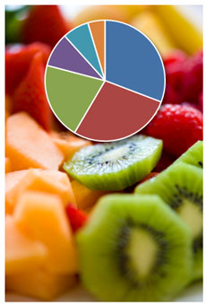
Mmmm. It all looks good. Where do I focus? (c) iStockPhoto / Adventure Photo

Mmmm. Fruit salad. It all looks good. But where do I focus? (c) iStockPhoto / Adventure Photo

By default PowerPoint or Excel 2007 will create multicolored pie charts or single-colored bar charts. Unfortunately, these default color combinations can cause charts to communicate less effectively unless they are modified.

In most cases, when you’re using charts in PowerPoint slides you’re trying to highlight a specific data point or a subset of data points:

Tags: , , , , ,


Apr 20 2009

Book Review: Slide:ology

Slide:ology by Nancy Duarte

Slide:ology by Nancy Duarte

Slide:ology: The Art and Science of Creating Great Presentations, written by Nancy Duarte, is a comprehensive guide to presentation design. Similar to Garr Reynolds of Presentation Zen, Nancy advocates a more visual approach to slide creation – a “new slide ideology” as she calls it. Nancy shares several design tips from her extensive design experience working with large high tech companies and high-profile projects such as the “Inconvenient Truth” presentation she designed for Al Gore. Continue reading “Book Review: Slide:ology”

Tags: , , , , ,


Apr 13 2009

PowerPoint and the Elusive Color Picker / Eye Dropper

An eye dropper tool should be baked into PowerPoint

An eye dropper tool should be baked into PowerPoint

If you’ve used drawing or photo editing applications such as Illustrator or Photoshop, you will be familiar with their color picker or eye dropper tools, which enable you to extract a color from an image so the same color can be added to other objects. I wish PowerPoint offered this same functionality, but alas it doesn’t. Luckily, there are many outside color picker apps that can be leveraged in conjunction with PowerPoint. Continue reading “PowerPoint and the Elusive Color Picker / Eye Dropper”

Tags: , , , , , , , , ,


Next Page »