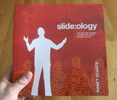
Slide:ology: The Art and Science of Creating Great Presentations, written by Nancy Duarte, is a comprehensive guide to presentation design. Similar to Garr Reynolds of Presentation Zen, Nancy advocates a more visual approach to slide creation – a “new slide ideology” as she calls it. Nancy shares several design tips from her extensive design experience working with large high tech companies and high-profile projects such as the “Inconvenient Truth” presentation she designed for Al Gore.
Overall, I recommend this book (3.5 stars out of five stars) as it covers valuable material on presentation design; however, I feel as though it could have been enhanced in a few areas to make it even more useful to the general public. Like Garr’s Presentation Zen, this book will not teach you any PowerPoint-specific skills – it provides visual design concepts that can focus and enhance your existing technical skills within PowerPoint.
Highlights of Slide:ology
When you crack open Slide:ology, you immediately notice that it is an aesthetically attractive book with lots of colorful images and slide examples. A few reviewers have noted that too many of the slide examples are thumbnails, but overall I didn’t find the images too difficult to read or understand.
As a presentation designer, I’m looking for inspiration, and it is great to see some of the high-caliber work that Nancy Duarte has produced for her various clients. I particularly liked all of the diagram options that are covered in Chapter 3: Creating Diagrams.
If you’re a non-designer, Slide:ology’s chapters 6-8 are particularly useful as Nancy shares insights into arranging elements in a meaningful way and effectively using backgrounds, colors, text, and images.
Criticisms of Slide:ology
One of Slide:ology’s greatest strengths is also one of its key weaknesses. As the owner of a successful presentation design agency, Duarte has a team with all of the tools and expertise to create great presentations. Unfortunately, most of the slide examples feel as though they require a graphic designer and additional software outside of PowerPoint or Keynote (i.e., Photoshop, Illustrator, etc.) to achieve similar results. It’s okay to create a high standard, but Slide:ology can never be more than “inspirational” for a majority of its readers who don’t have the same resources at hand. Inspirational is fine, but inspirational and practical would have been even better.
Another complaint I have about Slide:ology is the relatively weak quality of the case studies. They felt more like an ad agency’s client portfolio. The case studies in Slide:ology are more “look at what we’ve done and who we’ve worked with” (i.e., brochure) rather than “look at the problems these clients faced and how you can overcome similar problems” (i.e., true case studies). It feels as though an opportunity was missed to reinforce key concepts via the case studies.
Slide:ology vs. Presentation Zen
Nancy Duarte and Garr Reynolds are aligned in their presentation design philosophies, and even featured each other in their individual books. If you could only purchase one book, Slide:ology or Presentation Zen, which one would I recommend? I would favor Presentation Zen over Slide:ology for the following reasons:
- Presentation Zen’s overall structure of preparation, design, and delivery is easier to follow and more logical than Slide:ology’s structure
- Presentation Zen provides more insightful “before and after” slide examples
- I personally found Presentation Zen to be an easier, more concise, and more compelling read than Slide:ology
- Summary points at the end of each chapter in Presentation Zen were helpful to highlight and absorb key points
However, Slide:ology does have the following advantages over Presentation Zen:
- Slide:ology covers important design topics such as color, fonts, backgrounds, animation, templates, etc. that are missing in Presentation Zen
- Contains less extraneous philosophical content (Zander’s “one-buttock players”) and Steve Jobs worshipping
Despite its agency-centric perspective, Slide:ology is a good “next” book for anyone who enjoyed Presentation Zen and is still looking for ways to further improve his or her presentation design skills. Slide:ology is worth adding to your business library because you should be able to glean several valuable insights from Duarte’s vast design experience as well as gain inspiration from her beautiful sample slides.


April 21st, 2009 8:20 am
Great review. I agree with your trade-off, but I would just get both books. One additional good thing in Duarte’s book is the list of “flow diagrams”, basic structures of charts she pieced together from the hand-written notebooks of her staff. Useful reference.
April 25th, 2009 8:24 pm
Those two excellent books are complementary. It’s impossible for me to choose. We need to get both of them. This way, will have a more complete view on the subject.
April 25th, 2009 9:29 pm
If you spend a lot of time building PowerPoint presentations (as we do), then I agree you should just get both books. They are key contributions to the field of presentation design.
However, I think casual PowerPoint users should start with Presentation Zen. If they are still interested in learning more, they should then consider reading Slide:ology in my opinion.
July 13th, 2009 5:04 am
Hi Brent, just discovered your very useful site and have bookmarked it.
I enjoyed both books but found Nancy’s especially valuable for her insights on color and type, both of which can make or break a PPT presentation. For an added wow factor, try her tip on the Push Left transition (pages 22 and 190), which I have used to great effect in more than one presentation.
July 15th, 2009 8:25 am
I’m glad that you found my blog to be useful. Nancy’s book does cover some more detailed topics than Garr’s, which can be very helpful to presenters. It’s hard to choose between them — it’s best to purchase both if you’re serious about presentations.
January 31st, 2010 12:33 am
[…] 话了,请移步到这 里看下PowerPoint Ninjia写的书评。不过很可惜,此书目前还没有中文版 […]