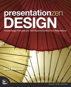
After his breakthrough book, Presentation Zen: Simple Ideas on Presentation Design and Delivery, Garr Reynolds brings us another offering to the presentation design altar, Presentation Zen Design: Simple Design Principles and Techniques to Enhance Your Presentations. If you enjoyed his first book, you should like his second book. I agree with other reviewers that it isn’t the same breakthrough as his first Presentation Zen book was, but it is a worthy follow-up book for fans of his blog and anyone who does presentation design on a regular basis. Overall, I give this book four out of five stars.
Highlights of Presentation Zen Design
As I mentioned, if you liked Reynolds’ first book, you get more of the same stuff you love in this book: emphasis on simplicity, stock photography, white space, no bullet points, fundamental design principles, interesting slide examples, etc. Going through Presentation Zen Design was a good refresher or reminder on what’s important for designing a strategic, keynote-style presentation.
In Presentation Zen Design, Garr Reynolds focuses on some new topics that were not covered in his first book: color, type, video, and data. All of these subjects were covered to varying degrees by Nancy Duarte in her Slide:ology book, and it’s nice to see Reynolds devote entire chapters to these key topics as I value his opinion on them.
Besides the helpful design suggestions from Garr Reynolds, in Presentation Zen Design you also get a great collection of featured experts, who provided useful insights on a variety of presentation-related topics. Some of these experts included David Rose (VC pitches), Nancy Duarte (storyboarding), John McWade (imagery), Scott Kelby (photography), and Stephen Few (data visualization). I felt as though these subject matter experts nicely complemented Reynolds’ content.
Criticisms of Presentation Zen Design
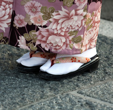
I’m a big fan of Japan and its amazing culture (e.g., sushi, ninjas, samurais, anime, tech gadgets, politeness, etc.). I’ve even been fortunate enough to have visited Japan three times in my life. Although the Japanese cultural references used throughout the book provided interesting visuals and a common theme, I don’t feel as though they pulled their weight in terms of better explaining Reynolds’ presentation design concepts or main points. In fact, I felt as though the various features on wagasa (umbrellas), tokonoma (interior design), and zen aesthetic principles were mostly tangential at best (nonessential as Garr would say) and detracted from the efficacy of the book.
Garr Reynolds, Nancy Duarte, Seth Godin, and other keynote presentation-focused experts seem to believe one approach fits all situations. For strategic presentations, a Presentation Zen Design approach is fantastic. What about the non-strategic, tactical slide decks that most presenters are dealing with on a day-to-day basis? Do we need remove all of the bullet points, use heavy amounts of stock images, and create handouts for all tactical presentations as well? For many tactical presentations, a pure Presentation Zen Design approach will be expensive, time-consuming, and ill-suited. Several of Reynolds’ design principles still apply to tactical presentations, but readers are unfortunately left to figure it out on their own.
My final minor criticism relates to the slide examples included in this latest book from Garr Reynolds. In his first book, I really enjoyed all of the interesting slide examples from various presenters, especially the before and after examples. I found it really helpful to see a poorly-designed slide side by side with a well-designed version. In Presentation Zen Design, I didn’t feel as though there were enough before and after examples, which was a little disappointing. In addition, there were too many slide examples from the same presentation design firm (Duarte Design). I would have preferred a greater variety of sample work from different professional and non-professional presentation designers. Nancy Duarte’s team is very talented, but I wanted to see a richer variety of styles and approaches.
Besides a slight Apple Keynote bias in Presentation Zen Design, Garr Reynolds’ second book builds upon the core concepts outlined in his first book. Overall, I believe Presentation Zen Design is definitely a good addition to your business book library if you regularly build presentations in your current role.


January 10th, 2011 3:40 pm
[…] uno de los usos con vídeo más originales, que explica en PresentationZen Design, consiste en combinar un vídeo sin sonido, que ocupa toda la diapositiva, con un titular encima. […]