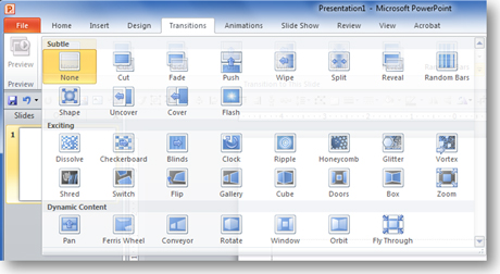
If you’ve used slide transitions in PowerPoint, you’ll be happy to know that Microsoft has upgraded the transition effects in PowerPoint 2010. They’re slicker and smoother than the stale ones that you’ve seen in recent versions of PowerPoint. In fact, if you’ve seen any presentations done on Apple’s Keynote presentation software, you’ll recognize some similar effects in PowerPoint 2010 (e.g., the “cube turn” transition). I believe the 19 new transitions were a direct response to Keynote’s more cinematic, professional-looking transition effects, which put to shame PowerPoint’s transition effects.
PowerPoint 2010 also gives presenters more control over the actual transition effects. In the past, the slide transitions were more or less uni-directional and fixed, but now you can adjust various aspects of the transition effects (primarily the direction of the effect). In the case of the new Glitter transition, PowerPoint 2010 lets you choose the direction of the effect and what shape it will use to create the effect (hexagon or diamond). Microsoft also introduced “dynamic content” transitions, which don’t change the entire slide (background + content) — just the content within the slide.

You get a whole bunch of new transitions in PowerPoint 2010 -- nineteen by my count.
Before you bedazzle your next presentation
With all of these new transition options at your fingertips, you may be tempted to “bedazzle” your next presentation. I’ve seen Keynote presentations where the cinematic slide transitions were used rather liberally — almost flauntingly. Before you start pumping flashy, new transitions into all your PowerPoint 2010 presentations, you need to re-consider the purpose of slide transitions. In most cases, slide transitions simply inform the audience that your presentation has progressed from one slide to another slide. That’s it. If your audience needs to wake up between slide changes, you may have bigger problems with your presentation content than even transitions can solve.

Just because you can, doesn't mean you should. Bedazzling isn't always the best idea.
I’ve referred to transitions as empty calories because I don’t believe they add much value (yes – even this “exciting” new group of transitions). If I bedazzle my sweaty workout t-shirt, it’s still going to smell. Sure it sparkles, but I don’t think most people will get past the odor. In other words, flashy transitions aren’t going to save a bad presentation. I would even argue that they can potentially detract from a good presentation. Initially, the new transitions in PowerPoint 2010 will be a novelty but eventually the “wow factor” will wear off when most people are using Office 2010. I think presenters need to remember that the “wow factor” isn’t for their presentations but the presentation software they’re using.
If slide transitions aren’t used to better communicate your message, they really shouldn’t be used. If you’re not trying to convey a particular message (e.g., photo slideshow) in your slides, bedazzle away to your heart’s content. However, I would argue that almost all business presentations should be focused on effectively communicating a particular message or set of messages to an audience. As a result, slide transitions will just delay, dilute, or detract from the message you’re trying to convey. I welcome creative applications of the new transitions to achieve better communication (there might be some specific scenarios where it makes sense to use transitions — e.g., Nancy Duarte’s push transition technique), but I’m concerned that in most cases the new transitions will just be used to bedazzle presentations needlessly — substituting sizzle for substance.
More custom animation effects needed — not transition effects
Surprisingly, Microsoft only upgraded the transition effects in PowerPoint 2010 — there are no new custom animation effects. When I heard about the new transitions in PowerPoint 2010, I was hoping that they would add new custom animation effects as well (e.g., my vote would be for a pendulum effect where I can swing an object around a specific pivot point). I consider the two types of effects to be close cousins. Too bad only one side of the family got some cosmetic surgery — the side I don’t care about.
Using an approach I’ve called content staging, custom animations help to communicate information ON a particular slide. Transition effects focus on what happens BETWEEN slides. I care more about the message which is conveyed on a slide rather than the gap between slides. Maybe the next PowerPoint version will add more custom animation effects, which in my mind are far more valuable than any flashy transitions.
Note: Yes, I’ve finally upgraded to PowerPoint 2010 (PowerPoint ninjas are cautious animals). As I explore PowerPoint 2010 further, I’ll provide more insights into the features that I like and dislike. Stay tuned!


April 9th, 2011 3:40 am
[…] Dykes at the PowerPoint Ninja blog discusses new transition effects in PowerPoint 2010. In particular, he makes an interesting […]
September 17th, 2012 8:16 am
[…] fact, well placed PowerPoint animations can even make a presentation better. As Brent Dykes of PowerPoint Ninja puts it: “In most cases, slide transitions simply inform the audience that your […]