SmartArt is not PowerPoint + Bob Ross.
PowerPoint is often criticized for encouraging presenters to rely too heavily on bullet points and not helping people to communicate more visually. Microsoft added a feature known as SmartArt to help convert text into various stylized graphics. When you’re designing your PowerPoint presentation, you can quickly rotate through various shapes, colors, layouts, and styles in order to find the right graphic for your presentation.
For novice or casual PowerPoint users, SmartArt can be a handy tool for quickly making your presentation more visual and professional looking. If you decide to use SmartArt in your PowerPoint slides, you need to be careful because SmartArt is dumb.
Warning: SmartArt is dumb
Hear me out before you say, “Hey, PowerPoint Ninja, you’re dumb! SmartArt is the greatest.” By “dumb” I don’t mean “stupid”. When I refer to SmartArt as dumb, I mean what the Merriam-Webster dictionary refers to as “not having the capacity to process data.” In other words, SmartArt is not going to intelligently guide you to a diagram style that is appropriate for your content. SmartArt provides you with lots of visual options, but it is up to the presenter to choose an appropriate graphic based on his or her content. This is where presenters and SmartArt can go wrong.
Recently, I was asked to fix some slides that someone else had built. The main slide of the presentation emphasized the three core teams (consulting, training, and client support) within our client services department. The designer had used a diagram with three flowing circular arrows that has been re-purposed several times in various presentations at my company. The diagram wasn’t a SmartArt graphic, but like SmartArt it was used as a more visually attractive alternative to a boring list of bullet points.

The circular flow diagram wasn't an appropriate diagram in this case. The diagram needed to align better with the content -- aesthetics aside.
Replacing bullet points with the wrong graphic is worse than just having bullet points. It’s a downgrade, not an upgrade. The circular motion of the graphic implied that our customers flowed through consulting to training to client support — and then the whole process would be repeated over and over. If our clients never had to work with our client support team, I wouldn’t see that as a problem. And yet the diagram’s circular flow implied our customers would rotate through the different teams when this wasn’t intended or wanted. The diagram didn’t accurately portray what needed to be communicated — that these three teams are the core foundation of our client services organization. As a result, I changed the circular-arrow diagram to different diagram with three pillars — each pillar representing one of the three teams.
Choose your diagrams wisely
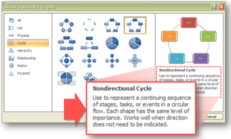
With diagrams you need to remember that the diagram style contributes to the overall message just as much as the actual labels do. You need to choose an appropriate graphic for what you’re trying to communicate. Each type of diagram — chart, map, timeline, venn, etc. — has different strengths, weaknesses, and preconceptions. PowerPoint users may not realize that Microsoft provides helpful descriptions of each SmartArt graphic and how they should be used in the SmartArt pop-up window.

Read the descriptions to make sure you're choosing appropriate SmartArt graphics.
If you’re looking for further guidance, Dan Roam’s book “Back of the Napkin” focuses on developing better visual thinking and provides a good framework for choosing appropriate visuals.
SmartArt just got smarter!
You may be wondering if PowerPoint ninjas are too cool to use SmartArt. Actually, I’ve frequently wanted to use this feature, but a fatal flaw of SmartArt has been the inability to ungroup and customize SmartArt objects directly. It was unfortunate that I couldn’t use a SmartArt graphic to get 50-75% of what I needed and then customize the remaining parts of the graphic to my liking. Unless my concept matched up nicely with one of the preset SmartArt graphics, I really had no use for SmartArt (99.9% of the time).
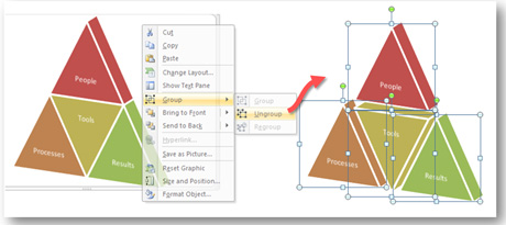
With the release of Office 2007 Service Pack 2, you can now ungroup SmartArt graphics. Rather than being forced to build your own ideas entirely from scratch, you can now ungroup and edit SmartArt objects when appropriate to save time. This small change turns SmartArt into another useful tool in your PowerPoint tool box. I’m glad I installed SP2 as it has fixed a number of annoying issues in PowerPoint 2007 and added this new option for ungrouping SmartArt (Note: Consult with your IT team before installing any service pack just to be safe). Kudos to Microsoft for making this change!

Office 2007 SP2 enables PowerPoint users to ungroup SmartArt. Just right-click on the SmartArt graphic and select Group > Ungroup.


February 1st, 2010 3:24 am
I agree! Smart Art is dumb!
The main issue I have with using it is the font size.
It often reduces text in a shape to size 10 or 12 – not at all practical for an onscreen presentation. It’s too small to read.
However, to get round the lack of ungrouping – you can simply copy the shapes from within the smartart and paste them onto your slide.
Then you can edit the internal text box margins & increase the font size!
simples.
February 1st, 2010 8:57 am
You’re right. By default, the font sizes get really small with SmartArt, which is a big problem. What good is a diagram if no one can read the labels? As you suggested, increasing the font size is another good reason to ungroup SmartArt diagrams.
September 2nd, 2010 3:50 pm
Perfect! I will get Service Pack 2. Just today, I tried to use a parts of a financial chart I’d created with PowerPoint’s standard chart tools. I could not ungroup portions of the chart, so I had to recreate a simplified version of the chart using the line tool. Sounds like with the installation of Service Pack 2, I can avoid having to redo my work. Thank you!
September 7th, 2010 5:09 am
How did you draw those pillar. They were superb. Can you give a small tutorial explaining it.
September 7th, 2010 11:56 pm
A Drawing in PowerPoint 101 article is on my to-do list.
February 20th, 2011 9:07 pm
Help with Smartart not coming in color: Anyone know why/what to do if in some 2010 PPT decks I am building i cannont get color in Smartart, but it does work in other decks???
March 14th, 2012 4:29 pm
hi! is the service pack compatible with MS 2010? if not, does the service pack for MS 2010 contain upgrades for smartart customization just like the one you mentioned? thank you
May 8th, 2012 3:19 pm
[…] caveat, though. SmartArt won't make you smarter. As PowerPoint Ninja bluntly put it, SmartArt is dumb. By "dumb" I don't mean "stupid." When I refer to SmartArt as dumb, I mean […]
July 5th, 2012 2:34 pm
You can customize smart art! you need to select all objects within smart art, copy and paste outside the smart art box onto your slide. you can then do whatever you want to each object (the are now all separate objects and can be deleted/modified as you see fit).
July 11th, 2012 9:02 am
I don’t think you read the entire post. I mention that you can customize the SmartArt at the bottom of the article. 😉