 After you have sat through a few hundred PowerPoint presentations, you start to see patterns in the presenters that you encounter. Hopefully, you have come across some truly inspired presenters that delivered memorable, meaningful presentations. Unfortunately, for every one great presenter you stumble upon, you may run into 15-20 bad presenters along the way (not including 30-50 average presenters). Continue reading “Attack of the Bad Presenters! Part I”
Apr 03 2009
Attack of the Bad Presenters! Part I
Mar 31 2009
A Humble Collection of PowerPoint Quotes
When I recently needed a few quotes mentioning PowerPoint, I wasn’t able to find many very easily. As a result, I thought I would share some of the interesting PowerPoint quotes I found from various presentation experts, academia, business, and TV/movies.
Over time I will be adding more quotes to this post. Please send me any good PowerPoint quotes that you have so I can add them to this collection. Continue reading “A Humble Collection of PowerPoint Quotes”
Mar 24 2009
Create a Cut-Out Effect in PowerPoint

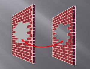
The shape on the right leverages the slide background fill effect to simulate a cut-out effect in the wall.
If you’ve ever needed to cut out a portion of an object, there’s really no easy way to do it in PowerPoint. You basically have to place another object on top of the object in question and fill it with the same color as the background. When the background is a solid color such as white or black, it isn’t a problem.
However, when your background has some kind of design or gradient, it can be hard to make a good match with the background. Many people may not realize that they have the option to fill a shape with the slide background, which can be used to create a simple cut-out effect. Continue reading “Create a Cut-Out Effect in PowerPoint”
Mar 17 2009
Enter the PowerPoint Design Triangle
You’ve been painstakingly working on your PowerPoint slides for the past few days. They’re close to being finished, and you decide to run them by your manager for some last-minute feedback. Big mistake. Instead of receiving the expected praise for your efforts, you end up being sideswiped by one of the following three things:
- Your manager asks for additional, unexpected content (e.g., “Can we add something on our new product line?”)
- She requests a significant change to the look and feel of your slides (e.g., “I don’t like the theme you’ve chosen or the colors you’re using.”)
- Your deadline changes (e.g., “I now need you to present these slides this afternoon, not on Friday.”) Continue reading “Enter the PowerPoint Design Triangle”
Mar 10 2009
PowerPoint and the Quest for the “Big Bang” Image
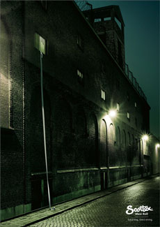
I was reading a recent post by Jan Schultink on finding that “one image or visual concept that really nails down the idea in one big bang.” Jan shared an example of a great advertising ad for Scottex toilet paper, which was highlighted on the advertising blog, adgoodness.
If you’ve read any of the popular presentation design books such as Presentation Zen or Slide:ology, you’ll be familiar with the visual presentation style that they promote. As you thumb through the pages of these books, you see several beautiful slides that demonstrate how well-chosen stock photos can emphasize a key point.
However, just looking at the finished product hides the time-consuming process that can go into finding a single “big bang” image. Sometimes it can be challenging to even find one good image for a particular slide let alone a “big bang” image. Continue reading “PowerPoint and the Quest for the “Big Bang” Image”
« Previous Page — Next Page »


