
Lots of photos are taken, but few are chosen. (c) Thinkstock
If you’ve read any presentation design books lately (Presentation Zen Design, Slide:ology, etc.), you’ve probably decided to use more images in your presentations. However, you may still be wondering if the images you’re selecting are good, average, or lame. Using more lame or average images in your presentations is about as helpful as adding more bullet points or animations to your PowerPoint slides.
“Good” can be extremely subjective or relative. Just because you’re using an image from a stock photography site doesn’t mean it is automatically good. If you’re using a stock photo in your presentation, you should have the quality basics covered – e.g., higher resolution (not pixelated), adequate size, professional-looking (proper composition, lighting, contrast, color, etc.), and not distorted (stretched).
However, these quality aspects don’t guarantee that a stock photo will be effective for a particular PowerPoint slide. I believe the following two factors define whether a photo or picture is a good presentation image:
- Image relevancy: Does it support/reinforce the key point or message of your slide?
- Image uniqueness: Does the image stand out and get noticed by your audience?
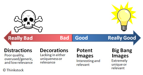
Moving from left to right, the images get more relevant and unique.
If you use poor quality, overused/generic images that aren’t relevant to your message, these images end up being distractions. They don’t complement your message, they just get in the way. If your images are unique but not relevant or vice versa, they become decorations — ineffective accents to your message.
If you use interesting and relevant images, your presentation slides will become more potent and powerful. In some rare cases, the stars align and you find an incredibly powerful image. This “big bang” image may end up being the star of your show, ensuring a key point is remembered long after your audience has forgotten the title of your presentation.
Image relevancy
A good presentation image is more than just a good photograph or illustration as it also needs to match your message. An unassuming but relevant image can suddenly click with a particular idea or concept you’re trying to share. It can feel like finding a missing puzzle piece in your presentation.

Text and images often need to work together to deliver the desired impact. (c) Thinkstock
A potentially good image can fall a part if it’s not positioned appropriately with your audience. As a presenter, it’s your responsibility to connect the dots for your audience between your message and your image. Like telling a good joke, an effective presentation image needs a good setup and delivery. Proper positioning of the image to show its relevance to your topic can be achieved either verbally or with the right supporting text (e.g., title, quote, statement).
Determining how you’re going to present an idea or concept can be the most difficult and time-consuming part of building a slide. As you settle on an approach, you may want to consider whether your approach supports rich imagery. You may find some topics don’t give you enough options to find a really good image. When appropriate, I like using analogies or metaphors in presentations as they can provide you with richer, more memorable visual options.

This slide uses content staging to introduce each image one at a time to build up to the main point of the slide. (c) Thinkstock
Another consideration that impacts image relevance is whether you’re trying to convey too many ideas or points on a single slide. Many people advocate for one idea or key point per slide. When you’re presenting only one message on a slide, your images have to be pertinent to your message. You can create really powerful and memorable slides using this approach.
In some cases, you might use several images to build up to the main message. Using a content staging approach, you can use animations to introduce the images individually. In addition, the “one idea per slide” philosophy may not always be practical or applicable (i.e., time to find multiple images for multiple points, cost to purchase multiple images, creating a summary slide, etc.) so your image(s) should tie into one or two of your key points.
Image uniqueness
Your image may be relevant or related to your message, but does it stand out? Is it going to capture the attention of your audience? I feel there are two main areas where a stock photo can be unique: the subject of the photo and the composition of the photo.
Subject of the photo
The subject of a photo is the focal point of the image. The focal point or main subject may be a person, place, or thing. There are a number of ways in which the subject can make the stock photo more unique:
- Avoid tired images: You’ve seen “the handshake”, “the globe”, “the arrow/dart in the target”, and “the chess piece” a thousand times. Whenever possible shake it up and find something a little different.

Do you recognize these images from Office 2007 clipart? Similar images have been used millions of times in presentations, brochures, websites, etc. If possible, try to break the cycle or at least look for more compelling variations.
- Unexpected application: Rather than using the standard product- or business-oriented photos for your presentation images, could you use something more playful, retro, or unexpected?

This slide compared managing multiple report suites (web analytics) to shepherding sheep. (c) Thinkstock
- Realistic vs. fake: Almost everybody in stock photography looks beautiful. Most stock photos of business settings (e.g., people in a meeting room) look overly staged or contrived. I often wonder if the attractive model smiling at the monitor screen in stock photos would even know how to turn the computer on. Keep it real so real people can relate to your slides.

The meeting images on the left feel staged or contrived. The images on the right feel more genuine as though a snapshot was taken at a real meeting. (c) Thinkstock
- Exaggeration: There’s a difference between something pretending to be real (unsuccessfully) and something that makes no attempt at being real. An exaggeration can really stand out and emphasize a key point. Use your best judgment with embellishments as they can come across as tacky or cheesy.

The image on the left relies on some Photoshop tricks and comes across as a little tacky. The image on the right emphasizes how we can feel overwhelmed with tasks and projects.(c) Thinkstock
- Focus on people: Garr Reynolds and Carmine Gallo mention that audiences respond positively to images with people, especially faces. Putting a human face on your presentation can help your audience better relate to your message, products, or services. Tip: Use pictures of people that match your audience. If your audience is more business casual, don’t use images that have people in suits and ties.

Close-ups of faces can really draw your audience into your message. It's funny how this model looks a little like Owen Wilson. (c) Thinkstock
- Tell a story: One well-chosen photo or group of photos can tell or imply a story that your audience can relate to. Stories are some of the most powerful ways for getting ideas to stick.

Each of these images is like a self-contained story. They need less explanation or elaboration to tie into your message. (c) Thinkstock
- Evoke an emotion: When appropriate, you can use photos to elicit an emotional response from your audience. Whereas logic helps people to draw conclusions, emotion gets people to act.

Real images are going to evoke emotions more readily than stock photography. This photo from Haiti captures a great moment in the relief efforts. When working with photos from flickr, be careful to respect the photographer's rights.
http://www.flickr.com/photos/dvids/ / CC BY 2.0
- Humor: Life is already too short and painful to put your audience through slide after slide of boring, lifeless content. If you’ve ever seen Seth Godin present, he effectively uses thought-provoking and humorous images throughout his presentations to engage his audience. You can too.

Stock images are more dependent on the setup and delivery to be funny. Most real-life photos like the two bottom images can stand on their own (from Strangefunnyworld.com). However, be careful with low resolution images and make sure they still tie into your overall message.
I’ve covered how good presentation images need to be both relevant and unique. I’ve showed how the subject can make images more interesting.
In Part II of this article, I’m going to look at the composition of the photo. Composition refers to how a photographer takes a picture in a specific manner to emphasize a focal point in a photo. The subject of two photos can be identical, but how a photographer composes the picture (e.g., rule of thirds, angle/point of view, framing, etc.) can make one image more compelling than another.


April 27th, 2010 1:56 pm
Wow, that is a lovely, comprehensive summary. Great post.
April 28th, 2010 10:58 am
Love the concrete examples! A very clear and helpful post for those struggling with the concept of images in slides.
April 28th, 2010 11:10 am
Excelent post!!! Waiting for part2!
April 28th, 2010 11:32 am
I love this post! I think we’ve come a long way from text-heavy, bullet-riddled powerpoint slides but man, I am getting seriously sick of the whole totally cliche stock photo with 2 words over it thing…
April
June 4th, 2010 10:33 pm
[…] Dykes offers two articles (part 1 and part 2) on how to decide whether an image is good for your presentation. If you’ve read any […]
August 13th, 2010 6:46 am
[…] en wil je weten wat een goede foto maakt voor je presentatie, zie ook deel 1 en deel 2 van What Makes an Image Good for […]
September 21st, 2010 6:15 am
[…] esempio l’ottimo PowerpointNinja dedica due post all’argomento, il primo dedicato ai tipi di immagini più efficaci in una presentazione, il secondo alle tecniche di posizionamento ottimale sulle […]
November 11th, 2010 9:43 am
Good point about the cliche images. Sometimes if something is photographed beautifully, you can get away with it, though. For example, a client recently supplied me with a slide that had a line drawing of a four piece puzzle.The art was ugly, but the client was insistent on using this visual metaphor. I went to IStock photo and found a great substitute. It was a black and white 3d rendering of a puzzle that had a lot of dimension to it. Somehow, this superior graphic, when inserted in to the presentation, didn’t look nearly as cliche.
November 11th, 2010 11:56 am
I agree. I’ve found interesting, cool photos that could be considered cliche. Sometimes it just comes down to using good judgment. There are no rules that can’t be broken when something just works for your message and audience.
June 13th, 2012 11:05 am
[…] Choosing good images for presentations — This blog post has excellent advice on finding relevant, potent images for your presentation. […]