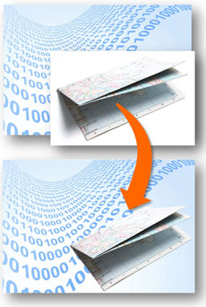
Remove the background from one picture so it can be layered on top of another. (c) Thinkstock
When you use images in your presentations, you might run into scenarios where you want to combine two images. In order to achieve the desired effect you may need to remove the background of one image so that it can sit in front of another image. In a past blog post, I explained how to do this in PowerPoint 2007. You can still use that approach in PowerPoint 2010 (Select image > Format > Color > Set Transparent Color). However, Microsoft offers you a new and useful option in PowerPoint 2010 to actually edit and remove the background of an image.
When I want a quick (and sometimes dirty) way of removing an image’s background, I use this new feature frequently. Sometimes I can’t achieve the desired effect and need to use Photoshop, but I’ve found it to be very handy in many situations. I’m going to step you through the process and share some tips that can help you when using this tool.
Step 1: Select image and format
The first step is to select the image you want to remove the background from by left-clicking on it. Once the image is selected, you’ll go to the Format tab and then go over to the far left side to the Remove Background button.
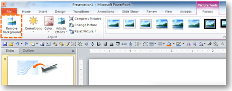
Once the image is selected, you’ll be able to find the Remove Background button under the Format tab.
Click the button and then the image will show sections of the image with a partially transparent pink/purple color. This color highlights the selected areas of the image that will be removed (i.e., transparent) when you’re done making your adjustments with the tool.
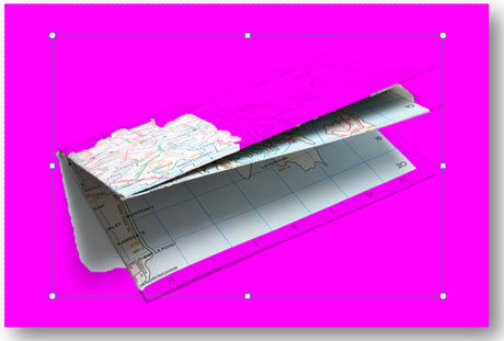
The initial selection will probably be garbled and will need to be cleaned up.
Step 2: Adjust frame
For some reason, PowerPoint has a frame that sits inside the image. I’m surprised the default isn’t the outer edge of the image, but by default it sits inside the actual image. The frame can be problematic because it can cause you to inadvertently crop a part of the image. The first thing you need to do is adjust the frame so that the area that you want to keep falls within this frame. In this example, I would have cut off the corners of the road map I’m editing so I adjust the frame outwards.
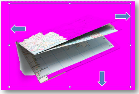
Position the frame around what you want to keep so the object isn’t cropped.
Step 3: Mark areas to keep
Now you’re ready to start editing which parts of the image you want to keep. If you look at the image above, you’ll see that PowerPoint auto-detected what it thought I wanted but didn’t get it completely right. Sometimes you’ll get lucky with the auto-detection and other times it will completely miss the mark (I’ve had it come up all pink).
In this case, I’ve got some work to do as the road map is missing some pieces and including pieces I don’t want. Click on the Mark Areas to Keep button which will enable you to draw lines within the part of the image you want to keep. You’ll notice the pink/purple space change as you draw lines. You may need to draw several lines to get close to what you want. If you want to remove a line, you click on the Delete button to select and remove a line you’ve added. Unfortunately, I find the pink/purple isn’t as transparent as I’d like, which can make it difficult to see the outline of the object. You may want to zoom in closer to make sure you get everything you need.
Note: You can draw a “keep” line outside of the frame, and PowerPoint will adjust the frame to include what you highlighted.
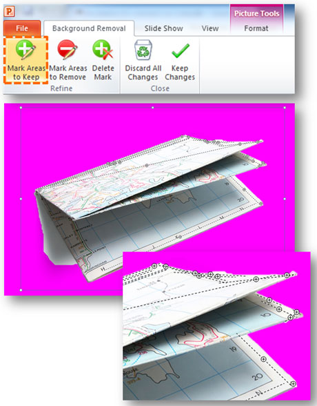
You may need to use several lines to include what you want.
Step 4: Mark areas to remove
Once you’ve included what you want, there may be parts of the image you don’t want to include that aren’t in the pink/purple area. If you click on the Mark Areas to Remove button, you can remove the parts that you don’t want to keep. In this example, I don’t want to include the shadow that came with the road map (Tip: you can create your own shadow in PowerPoint which will be transparent with the image below).
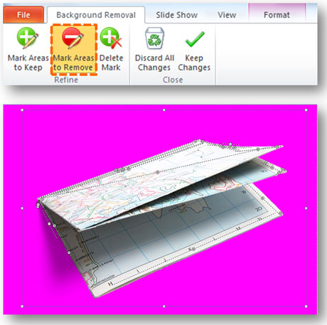
Remove the parts of the image you don’t want to keep.
Step 5: Touch up the edges
Often after you’ve defined the edges of the object, they might be a little ragged or they might have left out or included something that you didn’t want. You might need to refine and touch up the edges. I’ve found sometimes it can be helpful to have “keep” and “remove” lines on either side of the edge of the object. This way the line is more refined and straight. Unfortunately, the tool doesn’t give you the ability to curve a “keep” or “remove” line. That would be really helpful (hint, hint Microsoft). As a workaround for curved objects, you can stitch several small lines to the contour of the object.
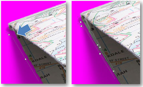
On the left I added one “remove” line and the tool cut off a piece of the corner of the map and the edge is ragged. By placing “keep” and “remove” lines side-by-side on the edge of the object I can get a straighter edge.
You’re done!
When you have got all of the edges you want, you can click the Keep Changes button or just click outside of the image to apply the effects to the image. If you want to edit the image further, you can click on the Remove Background button and it will bring up all of your current edits.

Here’s my digital road map, which is a combination of two images from Thinkstock.
As you use this technique, here are some other tips for you to consider:
- It’s easier to remove the background when you have the object on a white background or at least a solid background. It is more difficult to pull an image out of a complex background. Typically, the edges end up being more ragged in these cases.
- Use images where the object(s) have clear, solid edges. Sometimes the object in the image might be blurry, and it’s going to be more difficult to define the edges.
- Remember you can simplify the object by leaving out unnecessary parts. Only you will know what you left out.
- Remove shadows when defining the object’s edge. You can add your own shadow in PowerPoint, using its shadow effects.
- Recognize when the Remove Background tool isn’t going to achieve the effect you’re looking for. I’ve had to revert to Photoshop when the edges were too ragged in PowerPoint.
As an added bonus, I’ve recorded my first tutorial video on this topic. Good luck with using this feature in your PowerPoint presentations!


March 14th, 2013 4:30 pm
WOW! I never knew this function existed in Powerpoint. I can think of hundreds of times I could have used it. THANK YOU!
July 14th, 2013 9:14 pm
Thanks for this, I love the tutorial on how to do this. I plan to offer a similar tips article on the same for my members, I hope to reference this article and also share some of your techniques.
Dan