I was reading a recent post by Jan Schultink on finding that “one image or visual concept that really nails down the idea in one big bang.” Jan shared an example of a great advertising ad for Scottex toilet paper, which was highlighted on the advertising blog, adgoodness.
If you’ve read any of the popular presentation design books such as Presentation Zen or Slide:ology, you’ll be familiar with the visual presentation style that they promote. As you thumb through the pages of these books, you see several beautiful slides that demonstrate how well-chosen stock photos can emphasize a key point.
However, just looking at the finished product hides the time-consuming process that can go into finding a single “big bang” image. Sometimes it can be challenging to even find one good image for a particular slide let alone a “big bang” image.
In fact, there’s a good chance you may never find exactly what you’re looking for. What are the odds that a freelance photographer somewhere in the world was aligned with your same line of thinking? Time pressures can force you to settle for something that is less than ideal.
Why do ad agencies make it look so easy?
Ad agencies are very effective at leveraging “big bang” images so why can’t more presenters do the same? Besides a slight advantage in creative talent (PowerPoint ninjas are pretty creative too), advertising firms have a couple of aces up their sleeves in terms of finding “big bang” images that most everyday PowerPoint users don’t have:
- Budgets: Ad agencies have bigger budgets, which enable them to actually manufacture the “big bang” image they need. Most presenters don’t have thousands of dollars for a custom photo shoot with models, exotic locations, unique props, lighting, etc.
- Resources: If they don’t use a custom photo shoot, ad agencies can assign multiple people to research images for one project. They have access to extensive, professional stock image collections with advanced search capabilities (Getty Images). They also have in-house staff with advanced Photoshop skills to manipulate images into what they need.
What about creating a “big bang” with clip art?
If you don’t have the luck, budget, time, or Photoshop skills to find or create the right photo image, don’t underestimate the potential of customizing clip art to create your “big bang” image.
Although not as maligned as bullet points, I have encountered several presentation bloggers that criticize the use of clip art in PowerPoint presentations (they shall remain nameless — unless of course they self-identify themselves by commenting on this article).

If you don't like your audience, use these clip art examples. When I talk about using clip art to create big bang images, I'm not talking about these ones. My eyes are burning.
I’ll agree with them that there’s plenty of cheesy, overused clip art in Microsoft Office’s clip art collection. I’ll also admit that photography will frequently outperform clip art. However, these stock image advocates should not completely discount the practical and flexible nature of clip art.
In PowerPoint, you have a vast library of different clip art images — that even extends online. If you apply a discerning eye as you choose clip art (if you thought the clip art above was pretty cool — I can’t help you) and venture beyond the first 10 selections that appear in any clip art search in PowerPoint, you can actually find useful building blocks that will enable you to fashion your own “big bang” image.
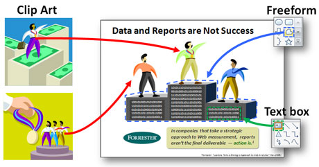
It may involve ungrouping clip art, stealing elements from one clip art and combining them with other clip art, editing some of the clip art objects, and then filling in the gaps with some freeform drawing. The key thing is you are in full control — no Photoshop skills required.

For this slide, I broke apart clip art, drew a podium using the Freeform tool, and added some binary data with text boxes. I might have been able to find a stock photo of some business people on a medal podium, but it would be missing the data element, which I felt was a key part of the image.
Unlike ad agencies, we’re not trying to win any Clio Awards. When the simple goal of a PowerPoint presenter is to effectively convey a key message to their audience, there is a big difference between visuals that are “good enough” (i.e., clip art) and “award-winning” (i.e., custom photography). Clip art can save you time and money in your “big bang” quest, and give you the flexibility to convey your big idea to your audience in the way that you envisioned it.
Remember the advice of The Gambler in your Big Bang quest
As you search for your “big bang” images or even just unique images, remember the advice of Kenny Rogers’ The Gambler:
“You got to know when to hold ’em, know when to fold ’em,
Know when to walk away and know when to run.”
I’m not saying that you need to give up on finding “big bang” photos and switch over to clip art. Just know when you’re not going to find anything for your concept due to its uniqueness, creativity, or complexity. Know when you may need to consider customizing clip art to your needs because no stock photographer could possibly predict exactly what you are thinking of. In many cases, illustrations can be just as powerful as photography, especially if they spring from your own unique brand of creativity.


March 10th, 2009 10:14 pm
Hi Brent
I agree that not all clipart sucks. Used judiciously it can be used to manufacture an image. The Articulate e-learning blog by Tom Kuhlman also has a great series of post on this. http://www.articulate.com/rapid-elearning/little-known-ways-to-create-your-own-graphics-using-powerpoint/.
I think taking your own photos is underrated. I have several clients who have set up their own creative and effective photos. Olivia
March 10th, 2009 10:22 pm
Olivia,
Thanks for sharing the article from Tom Kuhlman. It’s good to know I’m not the only one who leverages the Office clip art when it’s applicable.
March 10th, 2009 10:27 pm
I’m one of those people who discount clipart. That said, you make an interesting point. Spoken from someone who spent the day creating 12 slides.
March 10th, 2009 11:23 pm
Dean,
That’s okay. Clip art isn’t everyone’s cup of tea.
I’m just trying to prevent people from hurting themselves too badly as they venture into potentially time-consuming yet fruitless image searches.
March 12th, 2009 12:41 pm
Brent,
I can relate. My default when I abandon the image search is text. If I can’t make my point with an image, it’s unlikely I’ll make it with clipart. But you make an interesting point.
March 13th, 2009 4:56 am
Good points here Brent.
Re. clipart, there might be an opportunity for the “retro-clip art” chart, after a few “Zen” image slides, a (slightly improvised) but powerful clip art “mash up” comes in to make the point. The audience will remember and register. That’s the only thing that matters.
March 14th, 2009 8:57 pm
[…] Dykes debates when clip art might be “good enough” compared with photographic images. Unlike ad […]