 Back in 2008 when I started blogging on PowerPoint topics, I started a series of articles on important PowerPoint design principles. The first two articles were on consistency and control. However, for whatever reason I never continued the series and failed to cover other important design principles. During a recent business trip, I participated in two client presentations where the principle of contrast was overlooked and the oversight ruined the effectiveness of several PowerPoint slides. I thought it would be helpful to review this topic in hopes that other presenters can avoid unnecessary contrast issues.
Have you ever sat through a PowerPoint presentation and the presenter had to apologize to the audience for not being able to read text on the slide? That’s what I experienced on my business trip. Often it is due to the font size being too small, but just as frequently it can be caused by sloppy color contrast. While the most common application of contrast in PowerPoint is color, contrast can be created by having different object shapes, object sizes, font types, font sizes, alignment, etc. The principle of contrast is dependent upon the surrounding elements being noticeably different from the focal point. Contrast fails when the difference is too subtle or weak.

There are lots of different ways of showing contrast besides color.
For the purposes of this blog post, I’m going to focus on color contrast, which involves the difference in lightness or darkness between a foreground and background color. The strongest contrast is black on white or white on black. Because most PowerPoint presentations aren’t just black-and-white, you need to be mindful of the contrast principle in your design. With color contrast you also need to be careful about the hues you’re using on your PowerPoint slides.  If you look at a color wheel, colors on opposite sides of the wheel will have the most contrast; whereas, analogous hues that are next to each other have weaker contrast (e.g., red and orange, violet and blue). However, you also need to be careful with color blindness issues. Even though there is good contrast between red and green, not everyone in your audience can necessarily perceive the color difference. For a good, brief overview of effective color contrast, I recommend this Lighthouse.org article on the three perceptual attributes of color – hue, lightness, and saturation.
The Projector Curve Ball
 Designers need to carefully consider color contrast in their design work. Presentation designers have an additional curve ball thrown at them – projectors and LCD displays can significantly lighten or even alter the colors of slides when they’re projected. All the time spent on getting just the right color combinations on your laptop can be completely destroyed by an old, overused projector that hasn’t seen a new light bulb in a couple of years. It can also be ruined by too much light in the meeting room or particularly near the projection screen. As a general rule of thumb for presentations (with white backgrounds), you should design your PowerPoint slides as though all of the colors will be seen 20-30% lighter than what you’re seeing on your laptop screen.
I’d like to share three common scenarios where poor color contrast can ruin PowerPoint slides. I’ll start by sharing the two contrast-related mistakes I witnessed on my recent business trip along with a third one I’ve seen on several occasions.
Gradient steps or blends
When you have a process or flow diagram, it’s common to color the objects with different gradients – going from light to dark. Problems occur on the side with the lighter gradients if you’re using a light text color consistently across all of the objects. The light font will have good contrast against the darker gradients, but against the light gradient it can become ineligible, especially when you throw the projector brightness wildcard into the mix.
As you can see below, the light gradient with light text was too difficult to read even with the text shading. Unfortunately, the presenter had to pause and explain to the audience what the label was on the first object when he realized it couldn’t be read. If you’re using gradients, you either want to ensure you start darker on the light side or have darker text on the lighter objects (switching to lighter text on the darker objects).

This is the picture I took with my iPhone when I spotted this contrast issue. On the far left, the text was impossible to read because the white text didn’t contrast with the light gray object.

On a laptop screen, the text on the left is still legible, but once it is projected then the white text doesn’t stand out enough to be read against the light gray object. Either the background color on the object needs to be darker or the text needs to be darker — more contrast is required!
Green text
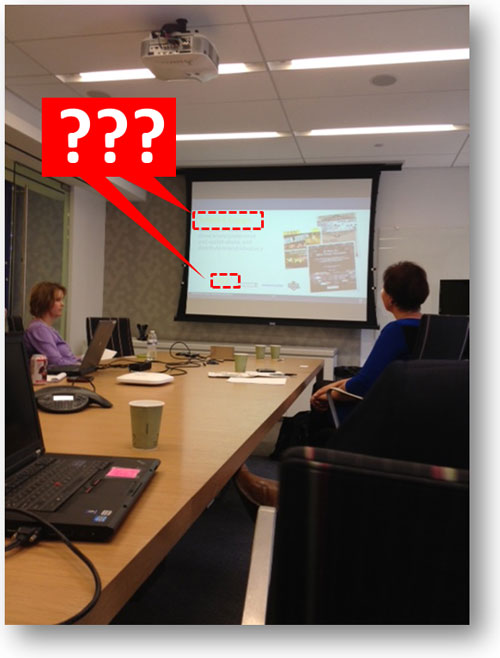
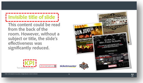
When using a PowerPoint template with a white background, you should avoid using certain colors for text. I’ve found that green or light green are not handled very well by a lot of projectors. There’s probably some technical reason for this, but I’ve learned over the years that this particular color is problematic. In the presentation below, the title of the slides and key metrics were in a lime green color. While it looked okay on a laptop screen, it became almost invisible when projected onto a screen. As a result, the presenter had to explain the purpose of each slide to the audience and verbally highlight key metrics that couldn’t be seen.
Be careful about the text colors you choose, especially for key text such as slide titles or data points. I would recommend never using green text due to how unreliable it can be with some projectors. If you’re using a template with a white background, use only dark colors for text.

Here’s another snapshot I took with my iPhone. This meeting was actually before the previous one, and the disruption to the presentation was more dramatic.

The lime green was visible on a laptop screen, but disappeared when projected. Not good if it’s used for the slide title or a key metric.
Colors on a dark background
My last real-world example comes from the Sunday school teacher at my church who uses PowerPoint presentations for her gospel lessons. She has a tendency to use red or blue text on a black background, which causes the text to be washed out and almost indistinguishable from the dark background. If you’re using a template with a dark background, don’t use standard colors such as blue, green, or red because most projectors struggle to project those colors with the same vibrancy as what you see in your laptop screen. If you’re using a dark background, always try to use light colors that will stand out when projected. Don’t be tricked by your laptop or desktop screen that the colors will display the same way when they’re projected.

Okay, no iPhone snapshot for this one so I’ve tried to reproduce what happened. While the colored text looks vibrant on your laptop (left), it can appear washed out when projected (right).
Don’t make your presentations hard to read; use appropriate levels of contrast for your text. There’s nothing wrong with black text on a light background or white text on a dark background. I know it might be a little boring but better boring than baffling (it seemed to work for Steve Jobs). If you’d like to get creative with your text try a different font or more expressive language—but don’t use font colors that won’t provide enough contrast.
You can also run into color contrast problems with other parts of your presentation besides text. For example, I was saddled with a corporate template (white background) which used a light faded orange color for its bullets. What might have looked stylish on the designer’s laptop, failed in execution. Simply because a brand designer failed to consider how the light-colored bullets would look on most projectors, hundreds of employees were communicating less effectively with their bullets (except for a rogue PowerPoint ninja who edited his version of the corporate template to include bold orange bullets). Be kind to your audiences and remember the PowerPoint design principle of contrast!

