Are your PowerPoint pie charts looking a little tired and stale? Is it time to make your pie chart data stand out? We’ve seen the same basic pie chart design since Office 97.

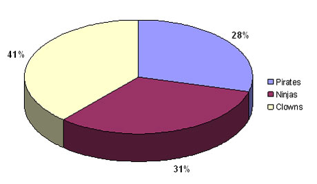
Look familiar? It's a whole lot of PowerPoint pie chart ugly. Wfffff. I can hear the air going out of your presentation if you're still using pie charts like this one.
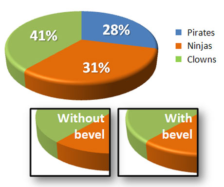
In PowerPoint 2007, there are many new shape effects that can help you to produce Photoshop-like results. One such effect is the bevel effect. When you use it in combination with your pie charts you can really add some zing to your PowerPoint presentations.
Introducing the Beveled-Edge Pie Chart

The pie charts in PowerPoint 2007 are generally much nicer looking than in previous versions. The bevel effect can help to differentiate your pie charts.
The bevel effect is a new shape effect in PowerPoint 2007. When I first saw it used on a PowerPoint pie chart, I honestly thought the chart was produced by a graphic designer in Photoshop. The effect produces an attractive, clean-looking pie chart that almost looks like plastic — much different from the kindergarten construction paper-looking pie charts found in pre-PowerPoint 2007 slides.
How to Apply the Bevel Effect to a Pie Chart
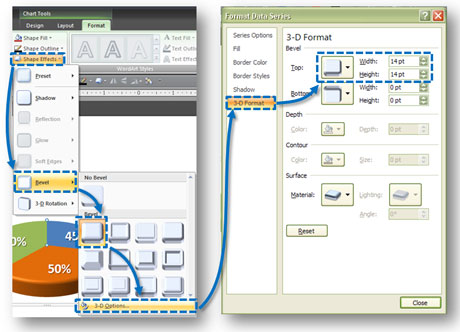
Once you have created your pie chart, make sure that you have the entire pie chart selected — not just a slice of the pie chart. On the Format tab of the Ribbon, select Shape Effects > Bevel > 3-D Options. In the subsequent Format Data Series window, select the 3-D Format and then adjust the top width and height. In the example above, I used 14 pt for both the top width and height.

After you have created and selected the pie chart, follow these steps to add a beveled effect to your pie chart.
Remember if there are more than 4-5 slices on your pie chart, a bar chart may be a better solution. Powerpoint ninjas are all over any Photoshop-like effect that can be accomplished in PowerPoint. Get ready to serve up your next PowerPoint 2007 pie charts hot and fresh with this beveled effect trick.


February 8th, 2009 4:09 pm
The bevelled chart looks nicer, but highlights how charts can easily be meaningless – she don’t add up!
February 8th, 2009 6:00 pm
D’oh! That was careless of me. That’s what happens when you use fake data to illustrate a point. I’ve corrected the problem you identified in the pie charts above (slices no longer add up to more than 100%), but you’re right that you have to be careful when you use certain data charts. At the end of the day, pretty doesn’t trump precise. I think data chart usage tips will make a good future blog topic. Thanks for catching that.
February 9th, 2009 2:30 am
Hi ninja,
First of all congratulations for your blog, I have discovered it recently and I love the tips for improving slides.
I have a blog in Spanish with a colleague about presentations and we have also published a post about charts where we mention your post:
http://present-arte.blogspot.com/2009/02/mejora-tus-diagramas-en-powerpoint.html
Best regards,
Ivan.
July 6th, 2009 2:53 pm
We like the bevel effects at my company, but have problems when they are in Word 2007 docs. If they are inserted as an active chart, they degrade when we make pdfs of the Word docs. Has anyone else seen this happen? We now insert then into the docs as pngs and that seems to solve the problem.
September 3rd, 2009 4:43 pm
I also love just applying a preset style from the Chart Styles gallery on the contextual tab that appears on the ribbon when you click into the chart.
February 25th, 2010 4:11 pm
How come your legend is not beveled?
February 28th, 2010 9:13 am
It’s because my legend is fake. I custom created the legend. I also didn’t apply the bevel to the little squares because I’m more worried about color matching than effect matching. Sometimes with the small squares, effects end up looking really weird and obscure the color, which defeats the purpose of the legend (what good is a legend if I can’t match the labels to the slices?).
Many times I skip the legend entirely and just label the slices directly. It would depend on the pie chart.
March 12th, 2010 3:37 am
Nice use of this effect. I love the new version, especially the new Master Slide capabilities
April 5th, 2010 10:53 am
i’d like to use bevel for a pie chart, but i need to know how to create it programmatically (vba). please place a source code. thanks.
April 9th, 2010 7:23 am
I may be a PowerPoint Ninja, but unfortunately I’m not a VBA ninja. I would ask your VBA question on this site.
July 2nd, 2010 1:59 pm
so, how do you get only 1 piece of the pie to show… sometimes we need to show only 1 piece. I used to do it on the old versions by simply deleting the extra pie pieces, but I can’t in 2007 ???? (and still keep the fancy bevelled edges)
May 10th, 2011 10:24 am
i need to create charts in power point via vba with 3-D effect (VBA) CODES NEEDED.
December 5th, 2011 3:09 am
thankyou
January 4th, 2012 9:04 am
Tina,
For a non-3D chart, you can fill the slices with white (and use no outline), but for pie charts, PPT 2010 requires that the pie chart form a complete 360 degree circle. One way around this is to create a pie shape from the shapes menu (looks like a 75% complete circle), then adjust the edges of that shape (shown as yellow diamonds) to become the same dimensions as the pie slice needed. To make this shape 3D, you can apply a bevel via Drawing Tools / Format / Shape Effects / Bevel, then make the shape have depth and 3D rotation through right clicking it, then “Format Shape…”, 3D format: Depth of aproximately 25, 3D Rotation: Y of about 320 degrees.
I hope this helps!
–Daniel
March 27th, 2013 8:04 pm
great tips!thx for sharing!