By default PowerPoint or Excel 2007 will create multicolored pie charts or single-colored bar charts. Unfortunately, these default color combinations can cause charts to communicate less effectively unless they are modified.
In most cases, when you’re using charts in PowerPoint slides you’re trying to highlight a specific data point or a subset of data points:
- “Look at how much higher the revenue is for this product”
- “See how the average for this country is much lower than those of other countries”
- “Notice how the quality score of this product is practically the same as those of other cheaper products”
In each example, you’re isolating what is the most interesting or relevant data that supports the point you’re trying to make to your audience. The software has no way of knowing which particular data point is the main focus of your graph or chart. It is up to you — the presenter — to ensure that your charts communicate effectively to your audience.
Modifying Bar Chart Colors
When you create a bar chart in Excel or PowerPoint 2007, the software defaults to a single-color chart. With a one-color approach, your audience cannot quickly understand the emphasis of your chart. Everything is equal other than the size of the individual data points.
However, it’s not always the case that the biggest or smallest data point is the emphasis of your chart. You end up having to highlight part of the chart with a circle or arrow to draw your audience’s attention to a key data point on the chart. Alternatively, you may have to physically point or scribble on the part of the chart during your presentation. There is a better way.

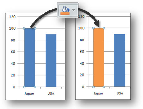
The chart on the left is the standard one-color default. We need to use other means to highlight a key part of the chart (e.g., circles, arrows, etc.). The chart on the right has been altered so that it naturally draws your audience's eyes to a key data point on your chart.
Using a contrasting color on a specific data point will naturally draw attention to a particular area of the chart. In order to alter a chart’s colors, you left-click on the chart so that all of the elements of the chart are highlighted. Then left-click again on the specific element, you want to highlight. If you’ve isolated the data point correctly, it will be the only part of the chart with small circles on its end points. You can then click on the “Fill Color” button on the Home tab on the Ribbon and select an appropriate contrasting color.

Select the data element that you want to highlight and then use the fill color feature to change its color.
Modifying Pie Chart Colors
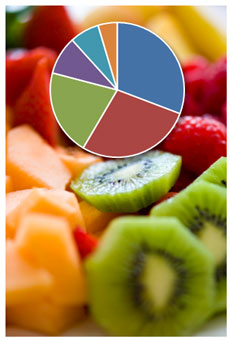
If you stick with the default setting for pie charts, all of the pie slices receive a different color, which makes it more difficult to isolate a particular part of the pie chart. You can adjust the style to a “one-color” version, but you still have the same problem with knowing which “tone” is the emphasis of your chart.

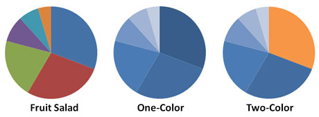
Under "Design" in Chart Tools in Excel or PowerPoint 2007, you can select a one-color style rather than sticking with the default "fruit salad" version.
Following a similar approach to the bar charts, it might be helpful to add a second color to a one-color style pie chart so that you can highlight the specific slice of the pie chart that you’d like to emphasize in your PowerPoint presentation.

The chart on the left is the default pie chart. You can select various one-color styles in Excel. You can create a two-color pie chart by editing one of the single-color styles.
PowerPoint ninjas know how and when to use colors to help communicate more effectively. Using contrasting color schemes in charts can help isolate key areas in your PowerPoint charts and help your charts to be more easily “digested” by your audience.


July 25th, 2009 9:50 am
Great advice, its so simple yet one of these things that is so often overlooked. I think with bar charts another way I think works quite well is by introducing the non-central bars first, and then by way of custom animation bringing in the relevant point.
I like the comparison to a fruit salad
July 25th, 2009 11:06 am
In PPT 2003, you could actually break apart (ungroup) charts more easily so you could actually animate them more easily. In PPT 2007, either all of the chart or parts of the chart end up as bitmap images which you can’t break apart. I talked about this problem in this post.
You can still achieve the same effect in PPT 2007 with some work, but unfortunately it is no where as easy as it was in PPT 2003.
July 26th, 2009 2:48 am
[…] 26, 2009 di giacomomason Vi segnalo un bell’articolo di Powerpoint ninja dedicato alle strategie di contrasto per i grafici. Effettivamente i grafici di PPt o di altri strumenti, se lasciati a se stessi, rischiano di […]
November 2nd, 2009 4:22 pm
What do you guys think of this article? It introduces theme color tools for your presentations! http://www.presentationzen.com/presentationzen/2009/11/using-kuler-to-create-color-themes.html#comments
November 10th, 2009 11:37 pm
I think it’s very cool…I mean “kule”.
September 4th, 2010 1:17 pm
You could also do a multicolored pie chart where all of the colors were muted or dulled down except for the one data point you want to emphasize. That one can be a fluorescent looking orange or lime green.
October 11th, 2010 7:47 am
Perfect what a great idea, thanks for sharing the tips!
September 12th, 2012 9:49 pm
[…] colorful charts, graphs or diagrams to attract attention. Refer each important segment of your presentation using colorful charts in order to keep the audience’s focus on your presentation. Always pick color so that even the […]