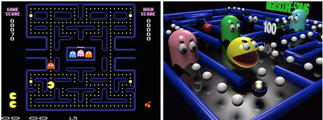
If you grew up playing video games in the 80’s, you’ll have fond memories of Pac-Man and Ms. Pac-Man. These classic arcade games were revolutionary in their day and continue to be favorites today. If you compare their simple 2D format to today’s lifelike first-person shooters, you wonder why people still continue to play them. The fact is their simple game play is still infectious.
Over the years, I’ve seen several lame variations of Pac-Man. In order to add sizzle to the Pac-Man theme, some game developers have tried to add a 3D perspective to the traditional 2D game — but with limited success. They took something simple and fun, and transformed it into yellow 3D crap.

2D to 3D: Don't mess with something that works
I’ve seen a similar practice with charts in PowerPoint. In hopes of making a chart more stylish or impactful, presenters may add a 3D perspective to their charts. Using 2D charts all the time can be repetitive and maybe even boring. I’ve shared how you can add a nice bevel effect to your 3D pie charts in PowerPoint 2007. However, I was recently reminded why you need to be careful with 3D charts.
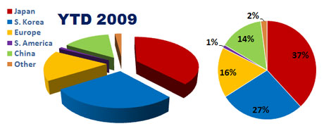
Someone recently asked me what was going wrong with a 3D pie chart in one of their PowerPoint presentations. Although Japan and South Korea represented 37% and 27% respectively, S. Korea looked larger than Japan (see 3D chart on left).

Why does Japan (red - 37%) look smaller than S. Korea (blue - 27%) in the 3D pie chart on the left? Compare it with the 2D version on the right to see how the slices are being visually distorted.
After examining what was going wrong, I identified that the 3D perspective was the culprit. Due to S. Korea being in the foreground, it deceptively appeared larger than Japan which was at the back of 3D pie chart. In the graph above, you can see how the 2D pie chart on the right more clearly reveals the true size differences between the various data points. If you absolutely have to use a 3D pie chart, I strongly recommend labeling the slices so that your audience can more easily interpret the data.
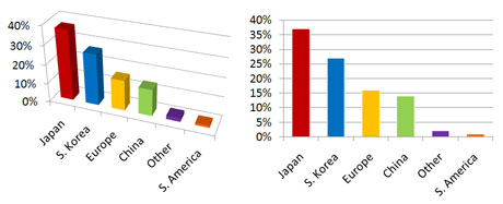
3D chart problems are not isolated to just pie charts. Bar charts can be difficult to interpret when a 3D perspective is used, especially the more extreme the 3D effect. When the 3D bar chart’s axis is angled or skewed, it becomes more difficult to compare data points and requires “value” labels in order to be usable.

3D bar charts can be difficult to interpret. 2D bar charts may be simple, but they are also easier to interpret.
When you’re debating between 2D or 3D charts, try to remember your audience. No matter how “pretty” your charts look, they need to be easily interpreted. Just like Pac-Man, it is never a bad idea to just keep things simple. If you’re interested in more information on this topic, Garr Reynolds of Presentation Zen fame has an interesting post on 2D and 3D charts.


June 30th, 2009 2:10 pm
Great post! I completely agree with the avoidance of 3D. A way to draw even closer attention to the data that’s most important is to use a 2-color scheme. So say your presentation contained the country chart above, and you were presenting in Europe. You may want to keep Europe yellow and change the other countries to grey. Now they know which data is most important.
June 30th, 2009 8:37 pm
I’d like to ditto everything Jon wrote and add that this is an education battle I have been fighting for some time now. So much attention and comprehension is lost when trying to make the charts look “cool” with 3D effects.
For the 2D bar chart, you should also consider cutting out some of the extra ink. For example, the multiple data points on the Y-axis are redundant along with the horizontal lines that spring from them. Using Jon’s Europe-centric scenario, have the Y-axis interval at 10 or 15%.
For the 2D pie chart, try moving the legend items into the chart itself with the values. This increases the information density (different from data density) and reduces eye movement and competing centers of visual attention.
July 2nd, 2009 12:42 pm
[…] by Russ Ray on July 2, 2009 This seems like an appropriate article, given that one of the topics for tonight’s class will be charts in Excel 2007. No matter how […]
July 4th, 2009 11:15 pm
[…] Dykes highlights how 3D charts can be deceptively misleading. In hopes of making a chart more stylish or impactful, […]
May 26th, 2011 2:51 pm
A little test you can give to anyone who doens’t believe 3D bars are bad…create a simple vertical bar chart with 3 bars, with y-values of 1, 2, and 3. Make it a 3D chart. Ask someone to tell you what values are represented by the bars. Depending on your 3D settings, most people see the 1 as ~0.8, the 2 as ~1.8, and so on.
March 1st, 2012 11:58 am
[…] Curse of Pac-Man: the Dangers of 3D Charts in PowerPoint …Jun 30, 2009 … If you grew up playing video games in the 80’s, you’ll have fond memories of Pac- Man and Ms. Pac-Man. These classic arcade games were … […]