It’s getting late, and you’re the last one in the office besides the late-night cleaning crew. With the soft buzz of a distant vacuum in your ear, you wonder how you’re going to bring everything together in time for tomorrow’s big presentation. You stare blankly at the empty slide in front of you, thinking just a few more slides and you’ll be done. Two hours later, tired and hungry, you’ve made some progress (if you call one mediocre slide progress) and even the cleaning crew has gone home now. Continue reading “How to Keep Your PowerPoint Creativity Flowing”
Dec 05 2009
Wayfinding in PowerPoint Presentations
Ever sit through 23 slides of a presentation and still have no idea how many more slides are coming? Maybe the presenter is just getting warmed up or maybe they’re wrapping up — who knows? You can’t always assume just because there are 5 minutes left, the presenter must be wrapping up. It can be difficult to determine where a presenter is in their presentation without some guidance. Continue reading “Wayfinding in PowerPoint Presentations”
May 28 2009
Seven Tips for Using Analogies in PowerPoint Presentations

I used this baseball analogy in Japan. Go Ichiro!
When you’re presenting a complex or unfamiliar concept, an analogy can be a very effective communication tool. An analogy draws connections between something unfamiliar and something well-known – e.g., web governance (complex / unfamiliar) and baseball (straightforward / familiar). Continue reading “Seven Tips for Using Analogies in PowerPoint Presentations”
Mar 24 2009
Create a Cut-Out Effect in PowerPoint

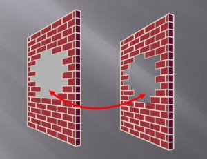
The shape on the right leverages the slide background fill effect to simulate a cut-out effect in the wall.
If you’ve ever needed to cut out a portion of an object, there’s really no easy way to do it in PowerPoint. You basically have to place another object on top of the object in question and fill it with the same color as the background. When the background is a solid color such as white or black, it isn’t a problem.
However, when your background has some kind of design or gradient, it can be hard to make a good match with the background. Many people may not realize that they have the option to fill a shape with the slide background, which can be used to create a simple cut-out effect. Continue reading “Create a Cut-Out Effect in PowerPoint”
« Previous Page — Next Page »


