Like makeup, bullet points should be noticeable but not distracting.
On the first day of Bullet Point Boot Camp, I covered consistency in relation to bullet points. Before we get into more meaty topics surrounding bullet points, I didn’t want to ignore the actual bullet points themselves and how they can become problematic if you’re not careful with them.
Like make-up, the actual bullet points in your presentation should be noticeable but not distracting. You want people to be able to easily scan your main points and not be diverted by dysfunctional bullet points.
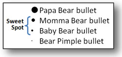
Bullet points can be distracting when they are too large or too small compared to the text size. You want to choose bullet points that are proportional to the text.

Momma and baby bear sized bullets are best.
PowerPoint provides several default bullet options (many that are lame), but you can select different variations and sizes of bullets. Just be careful when you do.

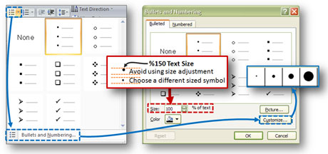
If you need a bigger bullet, select a larger-sized bullet point under "Customize". Do not change the text size as the bullet becomes off-centered to the line.
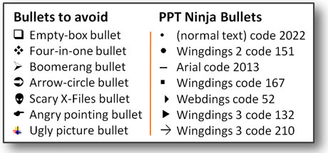
PowerPoint gives you lots of options to add unusual pictures and symbols as bullet points – avoid them! At the end of the day, your content – not the oversized wingding you chose as your bullet – should be the star of the show (or slide in this case). I’m not a fan of empty or non-opaque bullets as I don’t feel they stand out enough to perform well as bullets.

There are good and bad bullets. I lean towards basic shapes for bullets. I've included the font and character codes for some of the bullets I use.
In order to help your bullet points to stand out a little more, you might want to use a different color for your bullet points rather than using the same color as the text. If you’re designing a corporate template, your bullet points can leverage your brand colors rather than using the standard black color. If you do choose to use a different color for your bullet points, ensure the color isn’t too light or else you could undermine the effectiveness of your bullets.
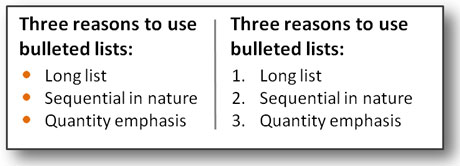
Finally, you should consider using numbered bullets when you have a long list of items, your items are sequential, or you are emphasizing the quantity of items (e.g., Five Steps to Losing Weight). I think too many presenters underutilize and underestimate the power of numbered lists. If they are used in the right situations, they can be much more powerful than standard bullets because the numbered bullets become an integral part of the message.

I don't know how evident it is in this example, but there is strength in numbers.
Prepare yourself for day three of Bullet Point Boot Camp where we’ll turn our attention to the layout and structure of bullet points.


September 15th, 2009 6:08 pm
The analogy between makeup and bullet points is priceless! Love it and will tweet it tomorrow!
Kathy
October 6th, 2009 10:17 am
Wow! – just taking the actual bullet points off of the text line doesn’t solve any problems. Read Cliff Atkinson’s book, ‘Beyond Bullet Points’, Garth Reynolds, ‘Presentation Zen’ and Nancy Duarte’s book ‘slide:ology’ Then re-do this entire series. The point is to put one thought per slide (no smaller than 40 pt text) with an explanatory visual. Put what used to be your bullets into the ‘notes’ section of the PPT slide so you still have all the information.
Say it with pictures. It works for Apple – remember the DOS prompt? Even PCs went to pictures.
Great forum, though!
October 7th, 2009 7:59 am
Jim, I have two comments. First, just like you read these books cover to cover, please wait until the series is complete before passing judgment on it. You’ve essentially read 1-2 chapters in a five-chapter book. Let’s re-evaluate my series at the end, not at the beginning.
Second, I have read Presentation Zen, Slide:ology, and am in the middle of reading Beyond Bullet Points. I actually have book reviews on the first two books on this blog. Those books inspired me to write this series because they ignore the simple fact that there are strategic and tactical presentations. A one point per slide and no less than 40 pt font size approach works for keynote presentations, but would be a bad approach for many tactical presentations.
Rather than avoiding bullet points entirely, I prefer to think of them as one tool in the toolbox. Bullet points have their place, and need to be used wisely. I’ll get into the usage / text density of bullet points in the fourth article in this series. Stay tuned.
October 23rd, 2009 1:01 pm
That’s interesting. You recommend bullets to be colored differently than text. Won’t that distract the viewer from your “Star of the show” text As an instructor of PowerPoint, we teach all of these features and functions and I try to throw in some sense of design sense so that new users do not lose their point in all the PowerPoint features. Great tips here!
October 24th, 2009 12:26 am
I think the color suggestion for the bullets is a preference thing. When the bullets are the same color as the text, they can disappear. I don’t feel as though it is distracting — just an accent to help differentiate the bullets from the text.
October 30th, 2009 1:03 pm
I believe you’re right about the numbers being more powerful. But sometimes that may stand in the way, especially if you’re describing steps of some process, list of actions etc.
Naturally, you’ll want to keep the numbers there, but won’t want them to capture too much attention themselves.
I’ve used fainter tints/shades of the main color for the numbers in such cases, with good results. It worked because the slides were bichrome.
Sometimes one might want to do the same with bullets, but it’s probably better to just make them smaller instead (which is not really an option for numbers).
September 22nd, 2010 2:40 pm
Good point about the empty bullets. The square ones
can easily be confused with checkboxes like you’d see on a form. And the other ones, well, who can really take them seriously? They fall into the category of wacky transitions and corny sound effects. It’s best to stay away from all of them.