Please keep Corporate America beautiful -- no bullet points!
Most presentation experts like Seth Godin and Cliff Atkinson are not big fans of bullet points. In fact, every time someone uses bullet points in a presentation slide, I believe Seth Godin sheds a tear. Many of these experts have initiated a “bullet point” backlash – advocating for a more visual approach with less text. This visual approach is really well-suited to strategic presentations (e.g., keynotes). However, most tactical presentations – the everyday variety that we see multiple times each week at work – depend more heavily on bullet points.
Rather than joining the universal ban on bullet points, I prefer to think of them as one tool in the presentation toolbox that like any other tool needs to be used properly. I may not be able to lessen the volume of bullet points, but I might be able to make them more palatable and less painful.
Asking presenters to give up bullet points is like demanding people bike into work every day. On paper, it’s absolutely the right thing to do — it saves the environment and provides great exercise to the individual. However, it’s not very realistic or appropriate in all cases. Rather than urging presenters to completely avoid bullet points, I want presenters to do the equivalent of “drive safely, telecommute once a week, and carpool whenever possible.”
Whether you’re a chronic “bullet point” abuser or someone just needing a refresher on bullet point best practices, I’m hopeful that this series of articles will help to improve your usage of these “dangerous” little dots.
Welcome to Bullet Point Boot Camp!
Most presenters use bullet points, but not everybody uses them effectively. Through this series of intense bullet point training articles, we’re going to raise the bar for your bullet point usage in PowerPoint presentations. Maybe you’ll want to anonymously forward these boot camp articles to your bullet point-handicapped manager or co-worker (welcome if that’s how you arrived here).
I have identified six key areas where bullet points can fall apart:
- Consistency
- Bullets
- Layout/Structure
- Usage / Text Density
- Content
- Delivery
DISCLAIMER: Although many of my suggestions could apply to other applications (e.g., reports, newsletters, blogs, etc.), I’m primarily focusing on what works well for presentations. I can’t guarantee that all of my recommendations will apply equally well to other situations.
Before we dive into bullet point best practices for presentations, I’d like to define what bullet points are.
Bullet points are concise, descriptive phrases that begin with a small dot, dash, or other graphic. Bullet points (or bulleted lists) are used in presentations to summarize or highlight a related set of key facts or ideas that will be covered by a presenter.
You may think there’s not much to bullet points – just the actual bullets and text, right? Wrong, my young padawan.

There's more to bullet points than just bullets and text...
Upon closer examination we’ll see there are several additional considerations: indents, lines, spacing (within/between), levels, etc. These different aspects of bullet points will come up as I review common mistakes made with bullet points.
Consistency
One of the key best practices with bullet points is to be consistent. Presentations can look less professional when different types of bullets, indents, spacing, font sizes, etc. are used within the same slide or across multiple slides.
Punctuation is a fairly minor but common consistency problem with bullet points. You’ll typically see some bullets with a period and others without in the same slide. As a rule of thumb, phrases don’t need a period, whereas complete sentences need a period. The key thing is to be consistent with your periods.
When it comes to bullet points, parallelism is your friend. Parallel bullet points are easier to read and understand. Poorly-formed bullet points frequently have the following parallelism issues:
- Verb vs. noun: Try to start all your bullet points with the same structure – verbs with verbs or nouns with nouns.
- Present vs. past: Make sure the tense of your bullet points is consistent.
- Capitalization: Capitalize the beginning of your bullet points the same way.

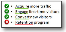
Mixing verbs with nouns is not a best practice. The last bullet should have been "Retain customers".
Symmetry is another key consideration when it comes to bullet point consistency. Try to use the same number of lines per bullet point. This may not always be possible depending on your content, but it can improve the readability of your points if you can accommodate it.
Get ready for day two of Bullet Point Boot Camp where we’ll discuss the little critters in front of your key points — the actual bullets.


September 14th, 2009 2:15 pm
very useful and straight fwd info. thanks
September 14th, 2009 5:38 pm
Excellent analysis! It is easy to just go with the no bullet point rule, but sometimes it is absolutely required.
You give us a fresh outlook and I salute you for questioning the “New” rules for ppt. We sometimes just follow what the “Gurus” tell us but there are a lot of excellent ideas that you have presented. I especially need to be wary of the verb vs noun issues.
September 14th, 2009 10:31 pm
Thanks Sam. I don’t know if I’m ready to lead a bullet point counter-revolution yet, but hopefully my suggestions come in handy for “Joe the Presenter”.
September 17th, 2009 6:07 am
[…] PowerPoint Ninja has launched a Bullet Point Boot Camp. Now is the time to subscribe to the excellent PowerPoint design blog if you are not already a […]
September 23rd, 2009 1:30 pm
[…] PowerPoint Ninja has launched a Bullet Point Boot Camp. Now is the time to subscribe to the excellent PowerPoint design blog if you are not already a […]
October 22nd, 2009 12:27 pm
Great ideas here. I know that BBP style is not just about eliminating bullets but moving through a topic with logical visuals. I think that some slides could use some bullets as you explain in small group settings. Now on to Day 2!