
Like real bullets, it's frequently not as fun to be on the receiving end of bullet points. (c)Shutterstock
You’ve survived the first three days of Bullet Point Boot Camp (day one, day two, day three), and now we turn our attention to a popular and controversial topic — the appropriate usage and text density of bullet points.
FACT: Presenters like bullet points more than audiences do. Bullet points can be relatively easy to pull together. You can do a brain dump into your slides, and then the bullet points serve as a helpful guide/outline for your key points as you present them.
On the receiving end, the experience isn’t quite as pleasant — very similar to real bullets. After about the fifth or sixth straight slide of pure text, you’ve lost your audience – or reduced them to a mindless lump of sub-organic material.
More than just “title and text”
The “title and text” format — a slide with just a title and bullet points (see layout #1 below) — should not be the standard for your presentations. Audiences have been abused over the years by slides with too much text. In spite of good content or a talented presenter, an audience is more likely to “check out” if they see too many “title and text” slides in a row.
The “title and text” format might be appropriate for an agenda or summary slide, but most of the time you’ll want to complement or replace your bullet points with an image, diagram, or chart. I’m not talking about random “decorations” but purposefully chosen graphics that support and strengthen your key messages. If you take the time to do this, the extra effort can really pay off.
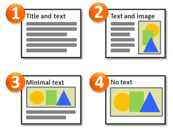
Use layout #1 sparingly. Most audiences will prefer the other more visual layouts.
In a recent article, I provide a useful technique for reducing and simplifying your bullet points. It shows you how to transform “title and text” slides (#1) into “text and image” (#2) or “no text” (#4) slides.
Strategic or tactical?
In another recent two-part article, I discussed the differences between strategic and tactical presentations. The main point of my article is that most presentation experts’ recommendations are tailored to keynote/strategic presentations and not the everyday tactical variety that most people work on. Prescribing guidelines or rules that work well for keynote presentations but not necessarily for tactical presentations can lead people astray.
It’s important to recognize what type of presentation (or slide) you’re building because it can change your approach. Text density is an important consideration for both presentation types. Generally, for both strategic and tactical slides, the less text the better. However, strategic presentations need to be far more visual than tactical presentations, and as a result will rely on bullet points much less than tactical presentations (e.g., more “no text” slides rather than “text and image” slides).
Text density factors
There are a number of key factors that shape the “text density” of a slide:
- Font size
- Number of bullet points
- Number of words per bullet point
- Number of lines per bullet point
- Text box width
Many presentation experts subscribe to a minimum font size (e.g., 40 pt. font). I am not as rigid in this area because I have different thresholds depending on the presentation type — I generally don’t go below 32 pt. for strategic slides and 20 pt. for tactical slides.
Some people may ask why not use a large font size for all presentations. In the case of tactical presentations, using a large 40 pt. font would mean leaving out a lot of details that your audience may need and expect. Having the missing details in a notes section or in a handout may be inadequate and untimely — ultimately undermining the success of your presentation.
For example, consultants need to provide detailed analysis findings and recommendations in their presentations — not high-level summary statements accompanied with eye-catching but uninformative stock images. In my own experience, I discovered that each type of presentation required a slightly different approach. Presentations may also be a mixture of both types, requiring the presenter to switch gears from time-to-time as they build their slides.
For strategic presentations such as keynotes, you want to use bullet points sparingly (5-7 bullets) and keep them to no more than one line per bullet point.
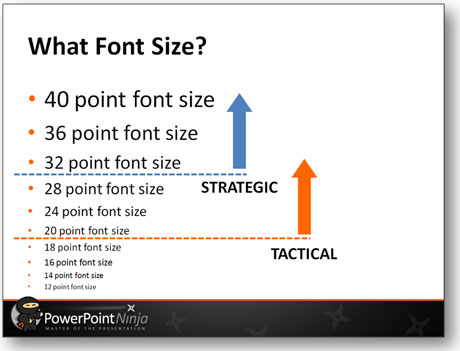
Use an appropriate font size for your presentation type.
As an alternative approach, David Paradi advocates a rough 6-by-6 guideline (he notes that it is not a rule but a guideline) with no more than six bullets on a slide and no more than six words per bullet. I prefer to count lines rather than words, but we share the same objective of reducing text density. I agree with Paradi that bullet points should not be full sentences and should only represent your key ideas.
Slideuments
Although tactical presentations should be visual too, they typically require more detail/text and need to stand on their own as references for guiding future action. Sometimes PowerPoint is used to create slideuments, which Garr Reynolds refers to as slides that are used like documents. I don’t have a problem with slideuments as long as they are never presented but just used as “quick summary” reference documents (i.e., more visual Word-lite documents).
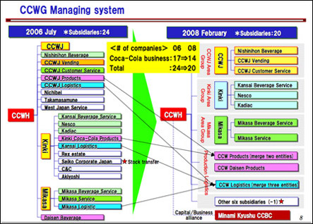
Garr Reynolds wants documents to be documents, and presentations to be presentations. I mainly agree, but don't necessarily feel as though all documents need to originate in MS Word.
Tactical presentations can lean towards becoming slideuments if presenters are not careful. In general, you shouldn’t go beyond two lines per bullet point (three lines for a half-length text box) for tactical presentations; otherwise, you’re really just having complete sentences masquerading as bullet points.
To avoid the tendency of reading longer bullet points in tactical presentations, it can be helpful to bold one key word or phrase within each bullet point. If you ever come across a bullet point where you struggle to highlight something, then that bullet point should probably be removed (i.e., trim the fat).
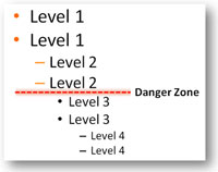
You should rarely have to go beyond two levels.
PowerPoint gives you the option of using multiple levels of bullet points. Your bullet points shouldn’t go beyond two levels; otherwise, your multi-layered bullet points can become overly complicated for audiences to follow (i.e., multiple indents). In addition, the more levels of bullet points you have, the smaller your font sizes get.
We’re going to wrap up the Bullet Point Boot Camp and cover both content and delivery on the final day.


October 30th, 2009 11:31 am
Excellent series article. I will definitely be passing this on!
February 13th, 2011 6:48 pm
[…] in the text that you’d like to emphasize. Listen to the Ninja, no more than five […]