Well, we finally arrived at the last day of my Bullet Point Boot Camp. We’ve covered several different topics:
- Day 1: Consistency
- Day 2: Bullets
- Day 3: Layout/Structure
- Day 4: Usage / Text Density
On this last day, I’m going to finish up the last two topics related to bullet points — content and delivery.
Content and bullet points
Content is king, right? We’re constantly reminded that content is the most important part of your presentation. Content is presented as a combination of text, images, and verbal communication. Bullet points are one popular text-driven method for sharing content in PowerPoint presentations. In the previous article in this series, I mentioned how there are both tactical and strategic presentations. Bullet points can be useful for both presentation types, but are frequently more common and appropriate with tactical presentations.
For example, my company is going through the process of being acquired by another larger company. As a director, I was invited to a meeting where HR representatives from the acquiring company outlined what was going to happen on the first days of the acquisition.
The presentation I sat through was a good example of a tactical presentation. As a manager, I needed to have specific information and detailed steps on how to handle the various personnel aspects of the acquisition in relation to my consulting team. There were a lot of bullet points across multiple slides, but in this case it was okay because I absolutely needed to see that level of detail.
Appropriate level of content
Just because a particular slide or the majority of an entire presentation may merit the use of bullet points, you should consider how much text is necessary or appropriate. If your bullet points capture everything you’re going to say about a topic, then you could be tempted to read your bullet points.
Bedtime stories are really the only time when people want to be read to. Reading bullet points will have the same effect – it will put your audience to sleep, which is okay for toddlers but not for executives, co-workers, customers, or students.
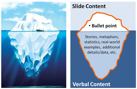
Each bullet point should serve as an introduction to a new thought or series of ideas. Like the tip of an iceberg, only a small portion of your idea or ideas is revealed above the surface in the form of a bullet point. You have “hidden” stories, metaphors, statistics, real world examples, etc. that you use to expand upon the text in the bullet point and make the key idea come to life for your audience.

For presentation purposes, your bullet points should only represent a main idea or key point but not all of your content. Like an iceberg, below the surface you should have additional information related to each bullet point that is shared verbally.
Delivery via content staging
You’ve determined that it’s appropriate or necessary to use bullet points on a particular slide. However, as you review the slide created you notice that there’s a fair amount of text on the slide. Whenever you present a slide that is more text heavy, there’s a good chance that your audience will read ahead and not listen to you as you present, which is not desirable.
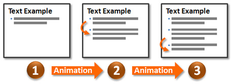
In these cases when I present a lot of information on one slide, I like to employ an approach I call “content staging”. In an article on this approach, I share how you can apply custom animations to your bullet points and introduce them one at a time as you’re ready to proceed. I prefer to use a subtle animation effect such as a fade and have the bullet points fade in quickly (set to “very fast”). Personally I don’t like the bullet points to come in slowly because then you have to wait for them to appear and it can interrupt your flow and become distracting.
I find this technique helps your audience to focus on what you’re saying and not be distracted by upcoming content. It also helps your audience to not become overwhelmed at the beginning of a slide by a large amount of content hitting them all at once.

Use animations to control the introduction of bullet points.
Summary
That’s a wrap on my Bullet Point Boot Camp series. I was able to cover a lot of different aspects of bullet points over the course of the past five articles. I’m not an advocate for abandoning bullet points or only using them one specific way. Like it or not bullet points are a big part of millions of presentations each year. Both strategic and tactical presentations leverage bullet points extensively for better or worse — and in different ways.
Hopefully through education and discussion, we can avoid some of the problems people have experienced with bad bullet points. Spread the word — bullet points are only dangerous to audiences when they are used inappropriately. Learn to use them wisely, and they can be a valuable tool in your presentation design toolbox.


October 24th, 2009 3:27 pm
[…] Dykes completed his 5-part series on bullet […]
October 27th, 2009 3:57 pm
Hi
I read somewhere that there is a negative psychological effect on not showing all your bullets points at once, with the audience feeling manipulated by the presenter. What do you think?
Cheers
Bill
October 27th, 2009 7:42 pm
I guess it’s a “damned if you do, damned if you don’t” situation. I’m not a psychologist so I don’t know which effect (too much text vs. not showing all content) is worse.
I think your audience might get annoyed with “content staging” if you don’t time your text revealing right (e.g., you’re talking about something that hasn’t been revealed yet). However, if it’s done right I think it helps to not overwhelm your audience and keeps them focused on what you’re covering. I’ve found it helps from my experience.
October 30th, 2009 1:36 pm
Thank you for your “boot camp”, I’ve attended all the days.
Can’t say I’ve found much new stuff for myself, but undoubtedly this series makes a good point (no pun) in stressing one thing:
If it happens so that bullet points is the most natural/simple way to present information in a particular case – then just use them, no matter what the opinions and misuses are. It’s just a tool, and if it’s adequate then it’s perfectly OK to use it.
And these five posts will help to eliminate most common mistakes.
As for the bullet point staging: yes, some people may feel manipulated. I think it takes building up some credibility before people let you walk them through the steps one by one. As such, this approach has more to do with personality of the presenter than with the slides themselves.
January 18th, 2011 6:02 pm
What you’ve said over these five posts is, I feel, really well done. But the standout? Highlighting the difference between STRATEGIC v’s TACTICAL presentations. This distinction in itself deserves a round of applause.