Like a rocket, introduce your content in stages to propel your slides higher!
When you’re presenting your slide content, the last thing you want to do is overwhelm your audience with too much information on any one slide. If you find that you have too much content on one slide, you can divide it up and spread it over several slides. However, sometimes it’s not about simply breaking the content apart across multiple slides but about displaying the information more effectively in bit-size, digestible chunks in one slide. In these latter cases, I leverage a PowerPoint Ninja technique called content staging.
PowerPoint content staging is an approach that strives to sustain the audience’s attention by revealing content in stages. Using custom animations, you can control how the content is displayed to the audience so as to not overwhelm them and help them to follow your train of thought.
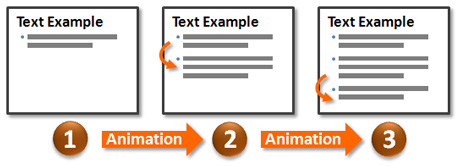
Staging Bullet Points
If you display several bullet points all at once, you will lose some of your audience members as they “read ahead” of what you are actually covering. Essentially, upcoming content that is visible can become a distraction. Whatever you’re explaining while your audience is distracted will fall on deaf ears. It’s a simple fact that most people cannot read and listen at the same time (just ask my wife). As they skip ahead, your audience can miss the connections you’re trying to make, ruining the efficacy of your slide.

Use animations to control the introduction of bullet points.
By applying custom animations to your bullet points (preferably with a subtle animation such as a fade), you can introduce them one at a time as you’re ready to proceed. Your audience will be able to focus on what you’re saying and not be distracted by upcoming content. Optionally, you can even dim the bullet point after you move on to the next bullet point so that previous points don’t become a distraction either. Typically, upcoming content is more of a distraction than content that has already been covered.
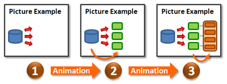
Staging Diagrams
A diagram may be the linchpin of your presentation, but if the diagram isn’t staged it can end up being less impactful than you anticipated. Depending on how elaborate the diagram is, it could lead to information overload for your audience. As you explain the diagram, your audience may not know where to focus their attention or they may be distracted by a particular part of the diagram.

Use animations to control how parts of a diagram are introduced.
Using custom animations, you can introduce parts of the diagram in a manner that focuses your audience’s attention and increases comprehension. Through content staging, you can ensure you’re in synch with your audience – they’re looking at what you’re talking about. For example, you might introduce the steps in a new process flow, pausing to explain each step in detail. Content staging also enables you to emphasize a key part of a diagram. For instance, you may introduce the axes of a graph, show some of the general data, and then highlight a key outlier.
Content Staging Considerations
Before you decide to use the content staging technique, there are a couple of things to ponder. First, content staging increases the number of “clicks” you’ll make during your presentation. If that could be a problem for any reason (e.g., someone else will be progressing the slides), it’s better to recognize that upfront when you’re building your slides rather than midway through your presentation. You might decide against using this technique in certain circumstances.
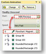
Second, when you use content staging, ensure the first segment of your diagram or first bullet point appears without a “click” (either using no animation or starting automatically with a “Start With Previous” effect). Nothing is more embarrassing than launching into your slide and then realizing that your audience has been staring at a blank slide for the past minute because you failed to advance the first animation.
Content staging requires more effort from presenters, but it can significantly enhance the comprehension and retention of your message. Take your PowerPoint presentations to new levels with this useful animation technique.


December 9th, 2008 12:51 am
A hidden PowerPoint treasure for editing complex “staged diagrams”, the selection pane in PPT 2007. In the home ribbon, in the arrange drop-down, all the way at the bottom.
December 9th, 2008 7:01 am
Excellent point, Jan. The new Selecton Pane is a godsend. The addition of this feature in PPT 2007 feels as though it was driven by users and not a Product Manager in a vacuum. Kudos to Microsoft.
December 16th, 2008 9:23 am
[…] Ninja: Content Staging: Propel Your Slide Content Higher — “When you’re presenting your slide content, the last thing you want to do is […]
March 26th, 2009 2:09 am
This one is a 100% match with my experience. I find the dominant way of presenting complex diagrams with a help of a laser pointer to be at least strange given the software.
Also, so far I didn’t have much problem convincing the organizing side to pass the remote/notebook to me.
One more thing to consider: having too many consecutive slides with such text animation has much the same effect as a crowd of bullet points would.
So sometimes you have to split the text across several slides, one item per each; or, it might even urge you to find an unexpected visualization for some of these concepts that ultimately contributes to the overall effect.
March 26th, 2009 6:22 am
It’s always a balancing act with text. Depending on the type of presentation (tactical vs. strategic), I might be willing to show more or less content (tactical = more, strategic = less). However, there’s always a threshold for how much text or copy your audience can absorb.
It’s always a good idea where possible to re-evaluate your text and determine if it can’t be presented in a visual way instead. As you noted, text slide after text slide usually doesn’t work. You should try to mix up if possible.
March 31st, 2009 10:57 am
[…] Dykes encourages us to use content staging when designing slides. If you find that you have too much content on one […]
June 15th, 2009 9:16 am
Why don’t you explain “how” to incorporate content staging into a presentation instead of just telling people that it can be done? Knowing it can be done is no help if you are looking for help to do it.
June 17th, 2009 7:52 am
In this article I provide two high-level examples of “how” it can be done for bullet points and diagrams. In terms of the details of how to set up animations, I’ve included a link to another two-part article on keys to creating effective animations.
February 15th, 2010 9:38 am
Another feature of the selection pane that I love is that is allows you to “rename” your elements just like the layers palate in Photoshop. Love it,Love it,Love it!
May 25th, 2010 1:11 am
[…] bring your audience on a journey through each of these parts. Powerpoint Ninja calls this technique content staging. When you’re presenting your slide content, the last thing you want to do is overwhelm your […]
November 21st, 2011 9:07 am
I agree with the effect of animation on the audience, however one problem that I face usually is when I want to skip a slide (sometimes because of time shortage), it takes 4 to 5 clicks to skip a single slide.
Is there any shortcut/key to make all the bullets of a particular slide appear at once?
December 24th, 2011 12:26 pm
You’re right. That aspect can be annoying. The only way to avoid the animation and go to the next slide is to enter the slide number and hit ENTER. However, that can be challenging if you don’t know the slide number. It would be nice if Microsoft gave us a shortcut to skip to the next slide.
pptninja
October 12th, 2012 12:47 pm
[…] should use animations is to stage the content on a slide. According to the PowerPoint Ninja, “PowerPoint content staging is an approach that strives to sustain the audience’s attention by revealing content in stages. […]