Shadow effects can help images to leap from your slides. (c) Thinkstock
One of my favorite new features of PowerPoint 2007 is the ability to add shadows to images, objects, and text. Previously in PowerPoint 2003, you were only able to add shadows to text — that’s it. You would need Photoshop and the necessary graphic editing skills to create professional-looking shadows for anything else. Now Microsoft gives you some Photoshop-like shadow effects in PowerPoint 2007.
Before I get into how to use PowerPoint 2007’s shadow effects, I’d like to provide a couple of use cases where shadows can be useful:
- Stacked images: When you stack one image on top of another, the top image can sometimes disappear into the lower image so that you can’t tell one image from another. The same applies to stacked objects. By adding a shadow to the top image, your audience can more easily distinguish between the top and bottom images.
- Emphasis: Adding a shadow to your images can help them to stand out more on your slides, especially when your images are white or light-colored on a white background.
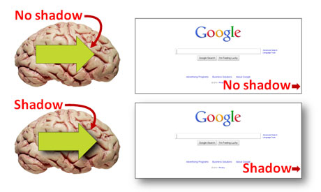
On the left, you can see how a stacked object (arrow) stands out more with shadowing. On the right, white images can disappear on a white background. The shadow helps the image to stand out more. (c) Thinkstock
How to apply shadows to images
If you’d like to add a shadow to an image, you have a few different options. First, my preferred method is to use the “Drop Shadow Rectangle” Picture Style. To do this you first click on the image, and then on the top Ribbon bar you select Picture Tools>Format. Within the Picture Style section, the fourth option from the left is the “Drop Shadow Rectangle”. I also like to add a dark outline to the picture when I use this approach. Note: This approach only applies to pictures, not objects.
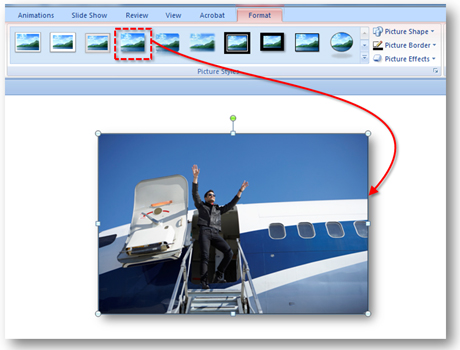
The Drop Shadow Rectangle option is simple and provides a good contrasting shadow effect. (c) Thinkstock
Second, another method is to use the Shadow effect within Picture/Shape Effects. You first click on the image or shape, and then on the top Ribbon bar you select Picture Tools (Drawing Tools for Shapes)>Format. For an image, you need to click on the Picture Effects button on the Ribbon and then select Shadow (for shapes, it is Shape Effects). From the shadow menu, you have three different outer, inner, and perspective shadow types with various orientations. I usually just use the Offset Diagonal Bottom Right option.
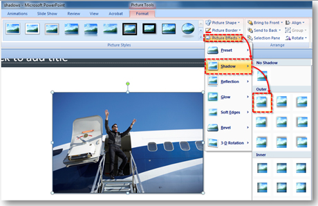
You have lots of options with the Shadow Picture Effects. However, I find the default shadow settings a little too subtle. (c) Thinkstock
Third, the final option is to manually configure the shadow for an image or shape using the Format Picture or Shape options. You can access these options two different ways. After following the steps above, at the bottom of the Shadow menu is the Shadow Options button. Alternatively, you can right-click on an image or shape and select the Format Picture/Shape button. You then select the Shadow tab on the Format Picture/Shape pop-up window.
Once you’re in the Shadow options, you can configure a variety of shadow settings: color, transparency, size, blur, angle, and distance. Experimenting with the various setting combinations will produce very different shadow effects.
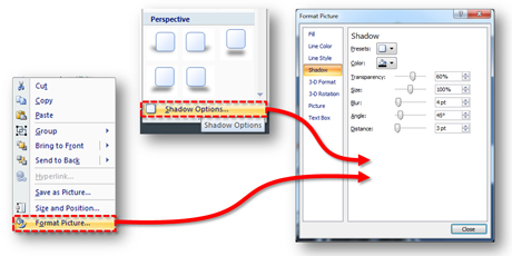
There are two ways to get to the Shadow formatting options. Once you're on the Shadow tab, you can play with the shadow settings to produce different shadow effects.
Consistency is key with shadows
If you’re using shadows in your PowerPoint slides, the most important consideration is consistency. Frequently, you’ll run across slides where shadow effects have been applied haphazardly across different images and shapes. They have different degrees/intensities of shading at completely different angles.
PowerPoint ninjas ensure their shadows are consistent. Approach shadow effects as though the imaginary light source casting the shadow is always in the same position on the slide (e.g., top left corner). In other words, find a favorite style and use it consistently across your slides — same intensity, same angle.
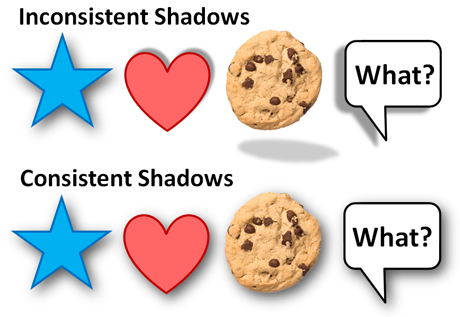
On the top row, the different objects have different shadow effects. The bottom row has a consistent shadow effect (the imaginary light source is in the top left corner). It's subtle, but it can make a difference. (c) Thinkstock
In order to keep your shadow effects consistent, the Format Painter tool can come in handy for similar images or shapes. However, there may be other formatting aspects (e.g., fill color, outline color, etc.) that you don’t want to copy over and the Format Painter tool isn’t as useful. Although it can be a little more tedious, you can use the third option mentioned above to manually configure the various images or shapes individually to match each other.
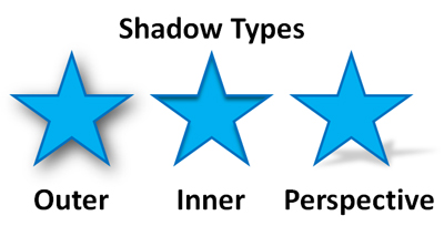
There are three main types of shadows. In order to match up shadow effects using the format options, you have to be within the same shadow type.
Unfortunately, Microsoft did not include the ability to easily toggle between shadow types (outer, inner, or perspective) in the format options. If you have an object that has an inner shadow and another shape that has an outer shadow, you can’t adjust the various settings (e.g., blur, angle, distance, etc.) to match them up because their fundamental shadow types are different. You would need to select one of the presets with the right shadow type from the drop-down menu before you could match up the object’s shadow effect.
Bonus shadow tip
When you have an image with a white background, you can make the background transparent so that the shadow is around the main subject of the image instead of around the outside edge of the image. If you’re unfamiliar with how to make a portion of your image transparent, this post will show you how to use this feature in PowerPoint. Once you’ve made the background color transparent, you just add the shadow effects using one of the techniques mentioned above. Good luck!
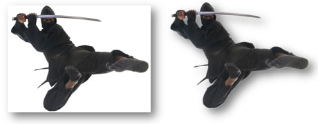
In most cases with images on white backgrounds, you'll want to make the background transparent and have the shadow around the actual subject rather than the outer edge of the image. (c) Thinkstock


August 9th, 2013 2:45 pm
Any idea why my Drop Shadow Rectangles do not print even though they show on my document? Thanks.
August 14th, 2013 5:26 pm
Make sure you’re printing in Grayscale rather than Pure Black and White. PowerPoint might take liberties with what it prints though.
pptninja