If you regularly use shapes and lines in your PowerPoint presentations, you should be familiar with the standard line style options such as width, dash type, and compound style. All of these options were in PowerPoint 2003 and have carried over to the latest version of PowerPoint. In PowerPoint 2007, they have added a couple of new options that you should be aware of — join type and cap type.
Join Type
I was recently trying to create an explosion shape, and the points of the explosion just didn’t look crisp. As I started exploring in the options, I found that the join type was the culprit.
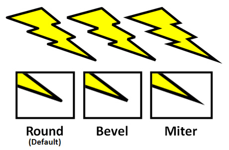
In PowerPoint 2007, your default setting for join type is round. There are two other options for join type — bevel and miter. In the image below, you can see the differences between each join type on the lightning bolt shape.

For explosions and lightning bolts (any shapes with sharp angles), the miter join is the way to go.
The miter join works well with any shapes with sharp or right angles such as squares, rectangles, etc. For example, I used the miter join for my explosion shape, and it looked much better than the default round join. The bevel join looks like someone clipped off the corner of the angle. The differences between the join types aren’t as noticeable if you’re using a thin line width (< 1 pt), but can be very noticeable if you’re using a very thick line width (> 3 pt).
Cap Type
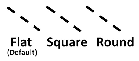
Once I discovered the effect of the join type setting, I became curious about the cap type setting. The cap type setting is only used with open shapes (e.g., lines), not closed shapes (e.g., squares). The cap type controls the endings of lines as well as the format of dashed lines. The default setting is flat, and you have two other settings — square and round. In the image below, you can compare the effect of each setting:

The flat and square settings are so similar, we probably didn't need both options.
There’s not really a huge difference between the flat and square options. The square option lengthens the line a little beyond the end points, but that’s about it as far as I can tell. The round option creates rounded end points for a line, and if it is a dashed line then each of the dashes will be rounded as well. I wish the arrow point on a line could have been rounded as well, but it isn’t changed by the cap type setting.
How to access line style settings

Most of these options should be familiar.
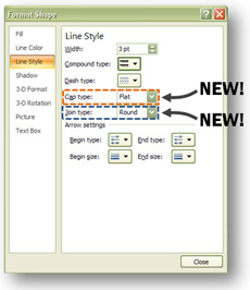
If you’d like to adjust the line style settings on one of your lines or shapes, you need to right-click on the object. On the pop-up menu, select Format Shape which is at the bottom of the menu. On the subsequent menu, select the Line Style tab from the left-hand side. You’ll then see the different line style options including the new join and cap type options. Good luck!


March 8th, 2010 11:32 am
Great post – as usual! To my complete shame I had NO idea you could do this.