Ever sit through 23 slides of a presentation and still have no idea how many more slides are coming? Maybe the presenter is just getting warmed up or maybe they’re wrapping up — who knows? You can’t always assume just because there are 5 minutes left, the presenter must be wrapping up. It can be difficult to determine where a presenter is in their presentation without some guidance.
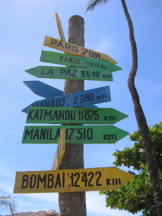
I recently drove up to Canada to visit family, and without the road signs and my trusty Garmin Nuvi GPS it would have been a far less enjoyable trip.
- How far to the next gas station?
- What restaurant options are coming up?
- When am I going to come across the next important turn-off?
Between the road signs and my GPS device, I could figure out how far I’d come and how far to the next important milestone.
Like long-distance road trips, many slide shows can benefit from “wayfinding” features to help audiences know where the presenter is in their presentation. There are a number of different scenarios where presentation wayfinding makes sense:
- Heterogeneous audiences: Your audience may be comprised of different functional groups with contrasting interests. For example, marketing people may not care about your financial impact slides, but perk up when you get into your branding and advertising recommendations.
- “Time is Money” audiences: You may have a limited window of opportunity with some audiences, and that window can abruptly close at any time without warning. For example, investors or senior managers may be a little more patient if they know where your presentation is taking them or what’s coming — they have the option to fast-forward through a section or jump to another part of your presentation.
- Multiple presenters: Whenever you have more than one presenter for a single presentation, the transition between presenters can be awkward for both the audience and team of presenters. Having clear indicators of where you are in the presentation will help to streamline the presenter transitions.

How many slides?!?
There are many helpful “wayfinding” elements that presenters can leverage in their PowerPoint presentations:
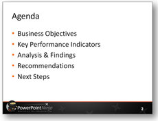
- Agenda slide: An agenda is a sign post for what is coming up in your presentation. It informs your audience of where you’re going to take them. Your audience will better understand the structure of your presentation and what content will be covered. Sitting through a presentation that doesn’t have an agenda slide is like driving down a deserted back road in the dark. Who knows what’s around the next corner?
- Handout: If you hand out a copy of your presentation, people will know exactly where you’re going. However, you now have a distracted audience on your hands — they will be reading instead of listening. Personally, I prefer to hold handouts until the end of the presentation so they don’t become a distraction. Handouts are not recommended for wayfinding although they can be used as such.
- Executive summary: Like written reports, presentations sometimes include an executive summary of the presenter’s content. Although an executive summary could be a useful indication of what’s coming, I don’t like presenting executive summaries as it typically leads to questions before the actual content can be presented in context. Typically, I hide the executive summary slides during the live presentation but then unhide them when I send my slides to a client. Executive summaries can be a useful wayfinding tool for pass-along presentations, where executives can determine whether or not they want to spend time reviewing the entire presentation or not.
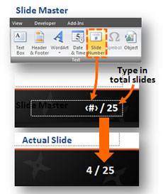
- Slide numbering: Numbering your slides helps audiences to know how you’re progressing through your presentation. However, just knowing what slide you’re on doesn’t tell your audience when the presentation is going to end. Using a slightly modified approach, you can edit your slide master so that the slide number is “slide X of Y total slides”, which will indicate both how far you’ve come and how far to go.
- Progress bar: Similar to an online checkout process for an ecommerce site, you can leverage the same technique for informing your audience of where they are in your presentation.You can add a progress bar to your slides, which lists all of the major sections of your presentation and advances as you move through them. I’ve seen progress bars used on the top, left, and bottom sections of slides.

Similar to a checkout process, you can use a progress bar to inform your audience of your position within the presentation.
- Transition slides: These slides act as milestones on your presentation journey. When you shift from one major section to another, a transition slide can inform your audience of the new section you’re entering. Most often I’ve seen the title slide layout used for transition slides. You can also combine the transition slide approach with an agenda / progress bar to indicate the current position within the greater framework of the presentation.

An agenda is like a sign post.

In a modified numbering approach, you can show the slide number and total slides.

Transition slides (in this case agenda-transition slides) act as milestones in your presentation.
Every presentation should include some of these wayfinding elements, even if it is just an agenda slide and slide numbering. Depending on your audience and presentation type, it may make sense to leverage more wayfinding beyond the basics.
The 17th-century English writer, Thomas Fuller, stated, “The fool wanders, a wise man travels”. Foolish audiences will sit through a presentation that provides no guide posts or milestones — they will wander aimlessly with the presenter. Smart audiences are looking for specific insights and information — they have a destination in mind. Most audiences are smart and won’t suffer meandering presenters. They will abandon such presentations — either physically or mentally. Wayfinding techniques can keep you in check with your audience as you take them down your intended path of enlightenment.


December 7th, 2009 12:02 pm
Hi, I like the idea of a progress bar. do you know if that is available in Powerpoint 07? I can’t seem to find it.
thanks for your help. I enjoy your blog.
Patrick
December 8th, 2009 1:20 am
Unfortunately, the progress bar isn’t a feature of PowerPoint 2007. Sorry if that wasn’t clear. You need to create it with objects in PowerPoint. I provided one sample, but I’ve seen presenters do it lots of different ways.
December 14th, 2009 1:06 pm
I especially like the idea of giving consistent looks to key points, supporting topics and review/summary slides. Using or designing multiple slide masters with an overall similar look with different colors for separate sections helps.
December 17th, 2009 12:35 pm
excellent tip, thanks…
December 18th, 2009 7:35 am
Hi Brent
Nice post. I agree with your point totally. Every presenter should help its audience by using some way-finding tools.
If the presenter informs the audience of the expected completion time and shows an agenda slide at the start, that should be enough.
However, I liked your ‘Progress Bar’ idea. For extremely long presentations and for presentations to impatient audiences this might be a good tool. On the flip side, for standard presentations, I feel this can act as a distraction as well. I would rather want my audience to hear what I am saying than to always now how many more slides are pending.
Having said that, I still feel for extremely long presentations (eg. corporate training), its a good tool.
March 31st, 2010 6:04 pm
[…] concept is about “wayfinding“ Ever sit through 23 slides of a presentation and still have no idea how many more slides are […]
October 18th, 2010 6:42 am
A good old sales trick: First tell people, what you are about to say , then you go though your stuff, and finally, you tell what you have said.
I have seen (and used) transition slides, where the chapter just finished shows up as a conclusion. Building on that – you can start setting the direction, and end, having summed up conculions all the way. My experience … it works.
October 18th, 2010 9:45 pm
Thank you for sharing, I liked your tips especially the progress Bar.
November 2nd, 2010 1:48 pm
The progress bar is a great idea for long presentations. Perhaps the audience would become less squirmy when the end is in sight. And an understated bar at the top (or bottom) of each slide would not be too intrusive. Of course, the ideal would be to have a presentation that is so engaging that the audience is just eating every bit of it up and doesn’t really care how long it is!
May 4th, 2011 3:08 pm
Great advice and great discussion. I tend to use agenda slides in my decks, and get frustrated that ppt07 doesn’t build in any functionality to make that easier. The frustration comes when I’m building a large deck with the agenda slide repeating 10-20 times, and I have to change something on the agenda…now I need to update (paste, edit, etc.) a lot of slides. Your article made me think of me an effective solution…build the agenda slide as a new slide in the MASTER deck. If things on the agenda change, now just update the master, and then go to your individual slides and (if necessary) move your arrows, box, or whatever you are using to indicate where in the agenda you are. Life is much easier that way if you have to fix a simple typo.
May 4th, 2011 9:31 pm
That’s an interesting idea. It sounds like it might be a good approach for agenda slides.
PPTNinja