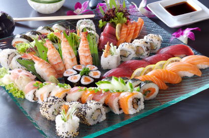
I’d like to share with you a useful analogy I thought of in terms of breaking down all of the critical components of a PowerPoint presentation. All ninjas love good sushi so I’d like to compare a PowerPoint presentation to a sushi restaurant setting. I will look at some key elements in a sushi restaurant: the meal, tableware, chef, server, atmosphere, and customers. In this blog entry, I will focus on the first three areas.

Ninja Food - (c) iStockPhoto / ShyMan
Meal (Content)
The presentation or “meal” begins with a recipe. Every presentation should begin with a plan and structure for how information can be effectively conveyed to a specific audience. Good sushi will require fresh, high-quality ingredients. In the case of a presentation, the “ingredients” are the copy, data, and images used in the slides. Stale data or inferior content can ruin any well-meaning presentation. Finally, the meal needs to match what the customers ordered or are expecting to receive. An appetizer can’t be served in place of a main course, and one type of food can’t be substituted for another kind. How would you feel if you ordered a Dragon Roll and received a hamburger instead? They both may be delicious, but the dining experience would be a disappointment nonetheless because you would be anticipating one dish and would receive another.
Tableware (Design and Layout)
If you owned a gourmet sushi restaurant, you wouldn’t want to serve great sushi on paper plates or with unclean chop sticks. Professional presentations need to have a good design and layout. Rather than interfering with the presentation experience, solid design and layout enables your “customers” to focus on the content of your PowerPoint presentation. “Content is king,” but more people will be willing to try your content if it looks “presentable and appetizing.” Make sure your slide template and design layout is on par with the quality of your content.
Chef (Presentation Builder)
If two people are given the same recipe and ingredients, why can’t they always arrive at the same result? Just like with great-tasting sushi, building effective PowerPoint presentations comes down to talent and experience. A seasoned sushi chef can produce an amazing meal in significantly less time than it takes another individual to create something totally inedible. If an important presentation needs to be done right, get the appropriate training or hire a professional. Adequate planning and preparation is important to a successful chef and anyone building a PowerPoint presentation. If a skilled chef isn’t prepared for his dinner guests, it doesn’t matter how much talent she or he possesses – the meal will be disappointing and not reach its full potential. Finally, just like great sushi, great presentations are dependent upon the creativity and artistry of their creator.
Look out for my next post which will cover the final three components of my sushi restaurant analogy: the server, atmosphere, and customers.


May 20th, 2009 9:40 pm
Thanks for the share. I have a random question? I am starting my own blog and want to know what is sharing too much information? lol and what is contributing? I want to get it right like your blog.
May 20th, 2009 11:21 pm
I’ve taken the approach that it is better to share more — rather than less. People want to get value from your blog posts. If you try to limit what you share, then people may not see the value. I’d rather have people coming back than coming only once.
As I’ve thought about it, it is impossible for me to share all of my experience and insights through my blog. People are still just getting a sampling even though it might seem like I’m giving away too much information. Good luck with your blog!