Too often I hear people talk about PowerPoint presentations like there is only one flavor of PowerPoint. If you read popular presentation design books like Presentation Zen or Slide:ology, you’d swear that most people are tasked with keynote presentations like Seth Godin and Steve Jobs are. A more visual approach with less text is definitely a good strategy for keynote presentations. However, let’s be realistic that only about 0.012% of presenters are delivering keynote presentations on a regular basis.
In my experience I’ve seen lots of flavors of PowerPoint – maybe not 31 exactly but plenty of different variations. Think about all of the unique factors that can shape a particular presentation:
- Audience profile — internal or external, novice or expert, friendly or hostile, etc.?
- Preparation time — hours, days, or months?
- Content types — strategic or tactical, persuasive or informative, professional or personal, etc.?
- Delivery method — in person, email, slide show, web conference, or handout?
- Number of presenters — Individual or group?
These aspects are only a sample of things that can necessitate a change to the format and approach of a PowerPoint presentation. As I’ve mentioned before, I believe there is only one golden rule for PowerPoint presentations – do what is right for your unique audience.
I get concerned when I see presentation experts espousing a “silver bullet” design philosophy that is really “keynote-centric”. There are a number of useful presentation design principles out there, but even a “Presentation Zen” approach isn’t applicable or right in all situations (I know, I know presentation design blasphemy).
PowerPoint Presentation Flavors
There are a number of different PowerPoint flavors – many of them would make Edward Tufte violently ill. Several presentation bloggers have proposed various presentation type frameworks.
First, Dr. Andrew Abela discussed two types of presentations: ballroom and conference-room styles. For Abela, ballroom-style presentations are your typical visually-rich, one-way keynote presentations (“colorful, vibrant, attention-grabbing, and (sometimes) noisy”). He states the objective of this presentation type is to “…inform, impress and/or entertain the audience.“
On the other hand, conference-room-style presentations are typically suited to two-way communication with smaller groups (2-25 people), and the objective is to “…engage and persuade your audience and change their behavior.“ Interestingly, he states that conference-room presentations should be presented on paper, not projected. Although paper handouts may be used from time to time, I think far more conference-room style presentations are just projected.
Abela makes another good point related to presentation types. “Each presentation situation calls for a particular presentation idiom — a form of expression and a set of design principles. Contrary to the popular complaint, the problem with PowerPoint is not that it forces you to design a presentation in a particular way. On the contrary, it doesn’t. And that’s the problem: PowerPoint allows you to mix design elements from different idioms, which, I believe, accounts for much of the ugliness and ineffectiveness of most presentations.”
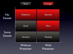
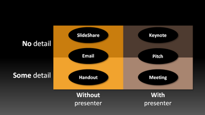
Second, Jan Schultink identified six categories: keynote, pitch, meeting, slideshare, email, and handout. He organized these different scenarios based on two key criteria: how much detail/text is in the slides and whether or not the presenter is present or not. In terms of the meeting category, Schultink noted that “over-simplified slides with beautiful pictures do not work in the small conference room with people ready to go through raw material.”
Third, Christophe Harrer took Schultink’s model and added another layer to classify Schultink’s six categories into two groupings: strategic (keynote, pitch, slideshare) and tactical (meeting, email, handout).

Christophe Harrer separates the presentation formats into two groupings: strategic (red) and tactical (black).
Harrer makes three important observations about this strategic/tactical paradigm:
- Tactical presentations are not less important than strategic ones. Implementing good ideas is as important as introducing new ideas. The sheer volume of tactical-level presentations makes them important through their combined contribution.
- You cannot devote as much time to an individual tactical presentation because you may be creating and delivering several of them each month. As a result, you may be re-using slides from a slide library to build your PowerPoint presentations on a regular basis.
- Strategic presentations on the other hand are unique masterpieces, where content is carefully selected and developed.
With so much focus on keynote or strategic presentations in popular presentation design literature and blogs, I fear that we’re ignoring the vast majority of non-keynote PowerPoint presentations. Not all of the design principles that work for keynote presentations apply equally to other presentation settings or scenarios. In my next article, I’m going to build upon the ideas of these esteemed bloggers and add my own thoughts on presentation types.


August 7th, 2009 7:31 am
I fully agree to your fear – the vast majority of my daily work are non-keynote presentations and more like the tactical presentations you’ve described. Besides the limited time for preparation and the often needed re-use of slides from other (previous) presentations (to stay in time and to avoid re-inventing the wheel) there is also a given corporate presentation template that has to be used and very restrictive rules about pictures that are allowed to use (to avoid the violation of copyright laws etc.).
But nevertheless at least some of the design principles can be applied – and by that I see the different books and blogs as a pool for inspiration or a “toolbox” where everyone can select what fits for him…