You’ve been painstakingly working on your PowerPoint slides for the past few days. They’re close to being finished, and you decide to run them by your manager for some last-minute feedback. Big mistake. Instead of receiving the expected praise for your efforts, you end up being sideswiped by one of the following three things:
- Your manager asks for additional, unexpected content (e.g., “Can we add something on our new product line?”)
- She requests a significant change to the look and feel of your slides (e.g., “I don’t like the theme you’ve chosen or the colors you’re using.”)
- Your deadline changes (e.g., “I now need you to present these slides this afternoon, not on Friday.”)
How do you manage these unexpected presentation changes?
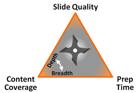
Enter the PowerPoint Design Triangle. The PowerPoint Design Triangle is comprised of three key factors in PowerPoint design: prep time, slide quality, and content coverage. It may not be that foreign to you if you’re familiar with the Project Triangle.

PowerPoint Design Triangle: Pick two corners and only two...
Prep time is how long it takes to build the PowerPoint presentation. Slide quality refers to the “polish” or “professional look” of the slides. Content coverage refers to the scope or focus of the presentation content. Essentially, the PowerPoint Design Triangle illustrates how the three interrelated aspects cannot be equally optimized – one “corner” will always suffer.
- Additional content means either less polish or more time to build
- Higher slide quality means either more prep time or less content coverage
- Less time to prepare means either lower slide quality or a limited content focus

GI Joe: Sage advice amid big hair, neon, and shoulder pads
In addition to these tradeoffs, content coverage has its own unique tradeoff between content depth and breadth (i.e., diving deep into one topic vs. covering multiple topics lightly).
The PowerPoint Design Triangle is a healthy way of explaining to managers, co-workers, clients, and yourself why there are tradeoffs when you’re building PowerPoint slides. Among the many nuggets I picked up watching afterschool cartoons in the 80’s, knowing what you’re up against is half the battle in your PowerPoint design (thanks Duke).


March 16th, 2010 6:50 pm
Those arent shoulder pads….he is wearing a backpack.
March 20th, 2010 8:53 am
The shoulder pads I’m referring to are the shoulder pads of eighties fashion.
March 21st, 2010 10:14 am
There is a simple rule
for all kinds of services:
We offer 3 kinds of service:
GOOD – CHEAP – FAST
You can pick any two:
GOOD service CHEAP… won’t be FAST
GOOD service FAST… won’t be CHEAP
FAST service CHEAP… won’t be GOOD