Secret sauce makes the burger and the corporate template
In a previous post, I explained why most corporate presentation templates fail to meet the needs of PowerPoint users because they are frequently created by people who don’t use PowerPoint on a regular basis. In my last article, I covered the basics of PowerPoint backgrounds and how they need to be designed in order to create an effective PowerPoint template.
If your background is designed effectively, is your corporate template ready for action? Not quite. There are a number of other important “secret sauce” considerations that go into creating a truly “usable” corporate presentation template:
-

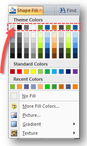
Theme colors are the default colors that appear on every Fill Color option. The hues of each Theme color appear below them.
Themes: In PowerPoint 2007, the Themes feature is an enhanced version of what was previously known as the Templates feature in PowerPoint 2003. As a template designer, you can now specify the default colors, fonts, and shape effects. Most PowerPoint users will appreciate having corporate colors (or a set of complementary colors) built into the template because most users won’t know the RGB codes of their company colors or which colors work well together. Tip: Watch the hues that are generated for the main theme colors because the hues may be unusable (too dark or light) depending on the theme colors you’ve chosen. To learn more about Themes in PowerPoint 2007, check out this video from Microsoft.
- Bullet point formatting: In the Slide Master (within the Design tab of the Ribbon), take the time to format the bullet points for each of the levels. I’ve seen PowerPoint templates where the bullet points were left with the standard black bullet points and even with insufficient spacing between the bullet point and the text. It is interesting that so much time and effort can be spent on creating an appealing background and so little on making sure the bullet points are up to par as well.
-

Choose and customize your layouts carefully.
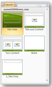
Slide Master layouts: In the Slide Master, the default configuration includes 11 different layouts. Many of these default layouts are unneeded (e.g., vertical layouts) and others may need to be customized to fit your company’s specific needs and the unique design of your background. Take some time to validate which of these layouts should be included in your PowerPoint template, which ones should be removed, and which ones need to be customized. Tip: Definitely keep the title slide, title and content, title only, and blank layouts.
- Footer fields: As you transition from PowerPoint 2003 to 2007, you’ll want to avoid using the footer fields in your template. In PowerPoint 2007, the footer fields found in the Slide Master are now editable when you’re building slides. This is undesirable because presenters can modify these fields inadvertently. Instead of using the footer fields, use text boxes for text such as dates or confidentiality statements because they will be embedded in the template and out of the way.
- Date fields: Corporate templates should not use the date field in the Slide Master. The date field is problematic because it always reflects the current date that the PowerPoint slides are being viewed. As a result, you don’t know when the slides were originally delivered. Putting the date as text (not as a date field) in a text box in the Slide Master will preserve the original date of the presentation.
- Text box and shape defaults: Ensure that the default text and shape colors have a good contrast against the background of the corporate template. I have seen PowerPoint templates where the default text box font color and shape color were the same as the background, which can be frustrating for inexperienced PowerPoint users who don’t know how to change the defaults. In addition, make sure your new PowerPoint template’s shapes don’t suffer from the dreaded shape resizing issue.
- File size: Watch the file size of your corporate template if you want to stay in good favor with your IT department. A ‘fat’ PowerPoint template can quickly lead a few extra servers once it’s multiplied a few thousand times by various presentations.
Have you run into any other corporate presentation template faux pas or best practices? Please share your list of template grievances or tips.


March 18th, 2010 2:06 pm
Great site–I just stumbled across it today. Keep it up!
I’m creating a corporate template for my company, and I have one best practice to suggest, and one issue that’s driving me crazy!
Best Practice: Prompt the user for consistent use of title slides. A new feature in PPT 07 allows you to change the type on a content placeholder so that it doesn’t just say “Click here to type the title,” it can say whatever you want, like “Type the client name here,” or “Type the project name here.”
Drives me crazy: Bullet formatting! We have selected the square bullet in red as our default first-level bullet. First, training all of the users to use the INDENT key instead of the bullet key to get the slide to respect the Slide Master bullet styles—ugh! it is a struggle. Secondly, the only way to insert bullets into a TABLE is to use the bullet key. There is no way that I’ve found to change the default hanging indent or bullet character that appears when the user hits the BULLET key. By default, our bullet key puts in a round bullet with NO HANGING INDENT. Argh! Any help you can provide would be much appreciated.
March 18th, 2010 2:23 pm
Another best practice is to have a default set of slides already showing in the template: Title, Agenda, Content, Thank You. Our Thank You slide has prompts for the presenter to enter their name, email and phone number while the company name, address, and URL are in the background.
March 20th, 2010 8:39 am
Those are a couple of good suggestions, Lori. Thanks.
Don’t get me started on the new table options in PPT 2007. At first, you think that you’re getting all of these great formatting options. However, when you start using the tables in PowerPoint, you get really frustrated fast. I’m not surprised bullet points are difficult with tables. I don’t have any quick solutions for you, but I’ll come back to you if I can figure out something.
April 10th, 2010 8:30 am
I’ve found the most reliable way to get a table into PPT is to source it first in Word, then copy and use Paste Special (MS Word Object) to bring the stuff into PPT. It’s not as kludgy as it sounds:) The table that’s brought in maintains all the properties of the original table – Word gives plenty of control over things like padding (under padding tables is a cardinal sin!)