Indie chose wisely. Can you?
When picking fonts for presentations or corporate PowerPoint templates, you need to be careful which fonts you choose. You may hate Microsoft’s default fonts (e.g., Arial), but if you’re considering using another font you’ll want to make sure it’s a commonly installed font. Why? When people go to view your file on their computers and they don’t have the same font, PowerPoint will substitute another font which may not be the exact same size or style as your original font (12 pt in one font can be smaller or larger in another font). As a result, all of your copy and labels may end up being misaligned or text-wrap in places you didn’t anticipate. In other words, your nicely designed slides can turn into an unintelligible, sloppy-looking mess simply because the computer you’re presenting on doesn’t have the right font.
In most cases, a non-standard or custom corporate font isn’t going to cause problems internally because theoreticallyeveryone at your company should have the corporate font installed. However, I’ve still seen problems with custom corporate fonts when your IT team fails to install these fonts on all new computers or re-imaged computers. When it comes to setting up a new computer or re-imaging an existing computer (i.e., restoring a computer to its default state typically after a bad crash or virus), fonts aren’t going to be the highest priority for IT. If you have both PCs and Macs at your workplace, it’s also common to run into font compatibility problems because PCs and Macs don’t share all the same fonts (e.g., PCs don’t have the Helvetica font by default).
While it can be an occasional problem for internal computers, it can be a serious problem when presenting on external computers or sharing PowerPoint files outside of your company. In my current role as an analytics evangelist, I’m not always presenting from my own computer. My company, Adobe, has its own set of corporate fonts, which is both good and bad. The corporate fonts are unique, clean, and professional. However, they can trip up employees when they present on external computers or share slides with another company.
In general, I’ve avoided using custom fonts because of the problems they create. I do use them from time to time, but I’ve learned to be very careful with them. At one industry event, I inserted a couple of slides from another co-worker into my slide deck. After joking about being the PowerPoint Ninja at the beginning of my presentation, I noticed to my horror that the inserted slides used the corporate font. I noticed it because all of the labels on one slide were a jumble of text (see below). Not only was I embarrassed, but the slide failed to communicate effectively to my audience. This experience highlights the importance of always checking what your slides look like on a different machine before presenting–something I failed to do and paid the price.
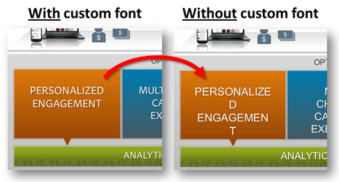
On the left, I’ve zoomed into part of the slide which is using the right custom font. On the right, you see what PowerPoint substituted when the computer didn’t have the same font. The substituted font messed up the text in several spots. Don’t make the same mistake!
If you present or share slides externally, here are some options for avoiding font problems:
- Use your own computer: If you’ve used several custom fonts, you can insist on presenting from your own machine. In some cases, this may not be an option at a conference where the audio/visual team wants to standardize the hardware being used or at an organization that doesn’t allow outside computers (security precautions).
- Provide custom fonts: If you need to present your slides on an external computer, you can provide the custom fonts along with your presentation. You then need to hope the audio/visual team for the event installs them, which can be a low priority for a very busy team. I’ve found you need to follow up prior to presenting to make sure the fonts are installed because it is a minor step that is frequently overlooked. Consider zipping the fonts and PPTX file together so it’s more obvious that they’re required. If you just want to share your presentation with people at another organization, you typically don’t burden them with installing a font on their computers (even though it’s easy). In addition, they may not be able to install fonts due to IT security restrictions.
-

It’s simple to convert any custom text into an image, which removes font compatibility issues. You should only notice a small difference between the text and image.
Convert custom font to image: If you’re only using a custom font in a few minor places, you can convert the text into an image. Just copy the text box, and then paste it as a picture. You remove the need to have the font installed and still produce the desired effect with the custom font.
- Embed custom fonts: In PowerPoint, you have the option of embedding custom fonts. One drawback to this approach is that it can significantly inflate the size of the PowerPoint file. Sharing large files can be unwieldy and you may need to use Dropbox or some other file sharing tool. Most people don’t know that they can embed custom fonts or may view it as a hassle and skip the extra step in the process, risking how their presentations are seen by others.
- PDF your slides: If you’re just sharing your slides, you can PDF your slides which will retain whatever fonts were used in the slides. However, if you PDF your presentation it will lose all its animations, which may not be a viable option.
- Avoid custom fonts: If you’re presenting externally on a different computer or know you’ll be sharing the PPTX file externally, you might decide to avoid using any custom or corporate fonts. While this may freak out the brand nazis at your organization, the most important thing is to communicate your message effectively. Brand considerations (especially at the font level) should be secondary to the message in my mind.
We all get tired of Microsoft’s default fonts–Times New Roman, Arial, etc.–but you need to be careful when choosing fonts, especially if they are included in a corporate PowerPoint template. You can’t assume because a font is available on your computer that other people have the same font. Other software products besides Microsoft products also install fonts on your machine. For example, Myriad Pro is a non-Microsoft font that is installed if you use certain Adobe products (Adobe Reader 7 & 8). While a font might be common among your team or department (because you use the same applications), it might not be shared across your company or outside of your company.
Unfortunately, if you want to be safe with fonts, you need to take a less exciting, lowest-common-denominator approach, which means limiting yourself to just widely-available Microsoft Office fonts. While I’m sick of Times New Roman and Arial, I’ve enjoyed using Calibri, which was introduced with Windows Vista and Office 2007. Before you decide on what fonts to include in your corporate presentation template, consider reviewing the following Microsoft Office font lists:

Choose your fonts wisely
If you have a font that isn’t on one of these lists, then you have a custom/non-standard font. Depending on your presentation and audience, custom fonts may not be an issue. If you’re only going to present on your machine and aren’t going to share the slides, it doesn’t matter what font you use. However, it’s important to think ahead so you can avoid unnecessary font-related surprises that can interfere with how effectively your content communicates. Choose wisely and good luck!

 Back in 2008 when I started blogging on PowerPoint topics, I started a series of articles on important PowerPoint design principles. The first two articles were on
 If you look at a color wheel, colors on opposite sides of the wheel will have the most contrast; whereas, analogous hues that are next to each other have weaker contrast (e.g., red and orange, violet and blue). However, you also need to be careful with color blindness issues. Even though there is good contrast between red and green, not everyone in your audience can necessarily perceive the color difference. For a good, brief overview of effective color contrast, I recommend this Lighthouse.org
  Designers need to carefully consider color contrast in their design work. Presentation designers have an additional curve ball thrown at them – projectors and LCD displays can significantly lighten or even alter the colors of slides when they’re projected. All the time spent on getting just the right color combinations on your laptop can be completely destroyed by an old, overused projector that hasn’t seen a new light bulb in a couple of years. It can also be ruined by too much light in the meeting room or particularly near the projection screen. As a general rule of thumb for presentations (with white backgrounds), you should design your PowerPoint slides as though all of the colors will be seen 20-30% lighter than what you’re seeing on your laptop screen.